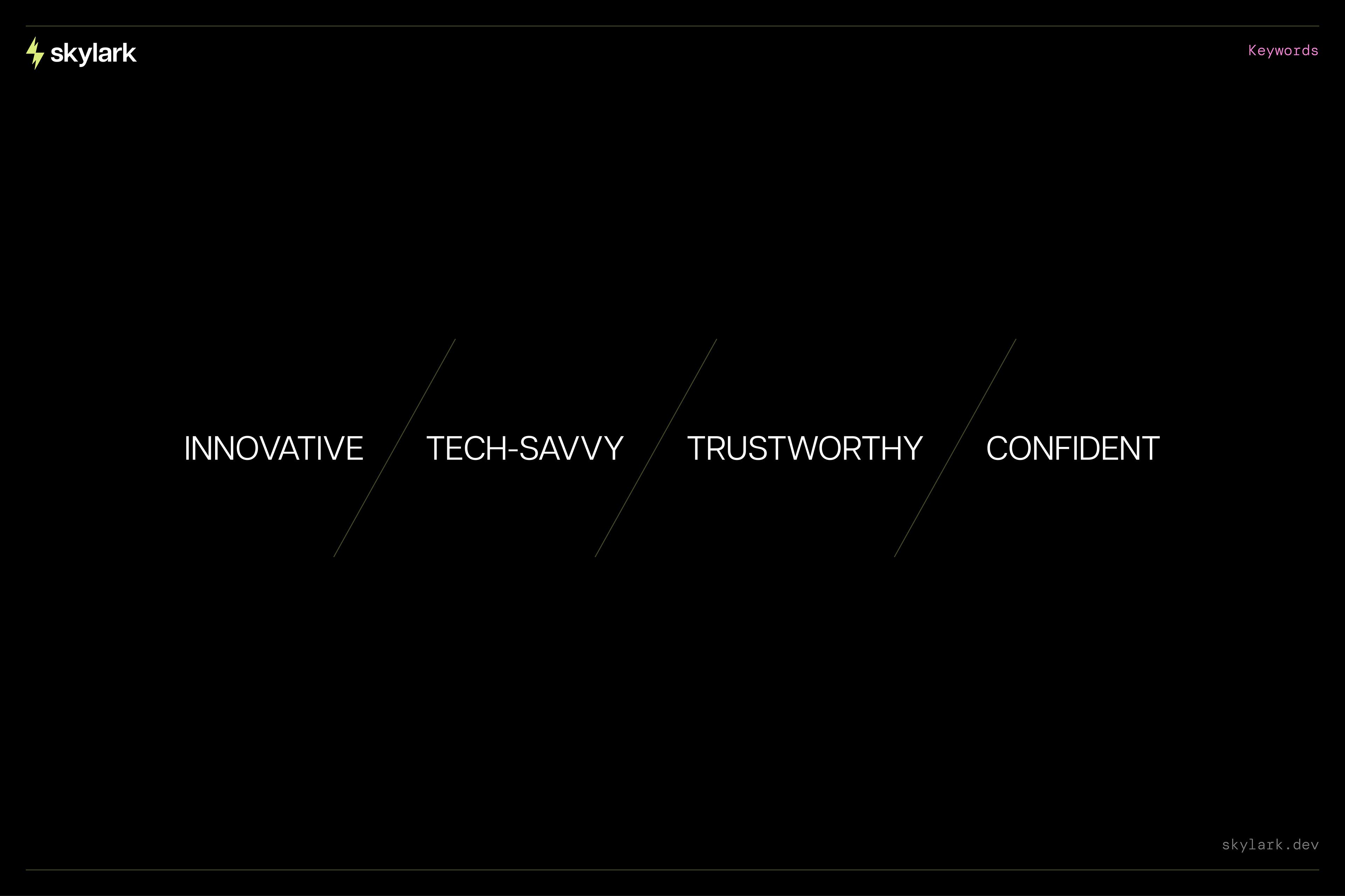
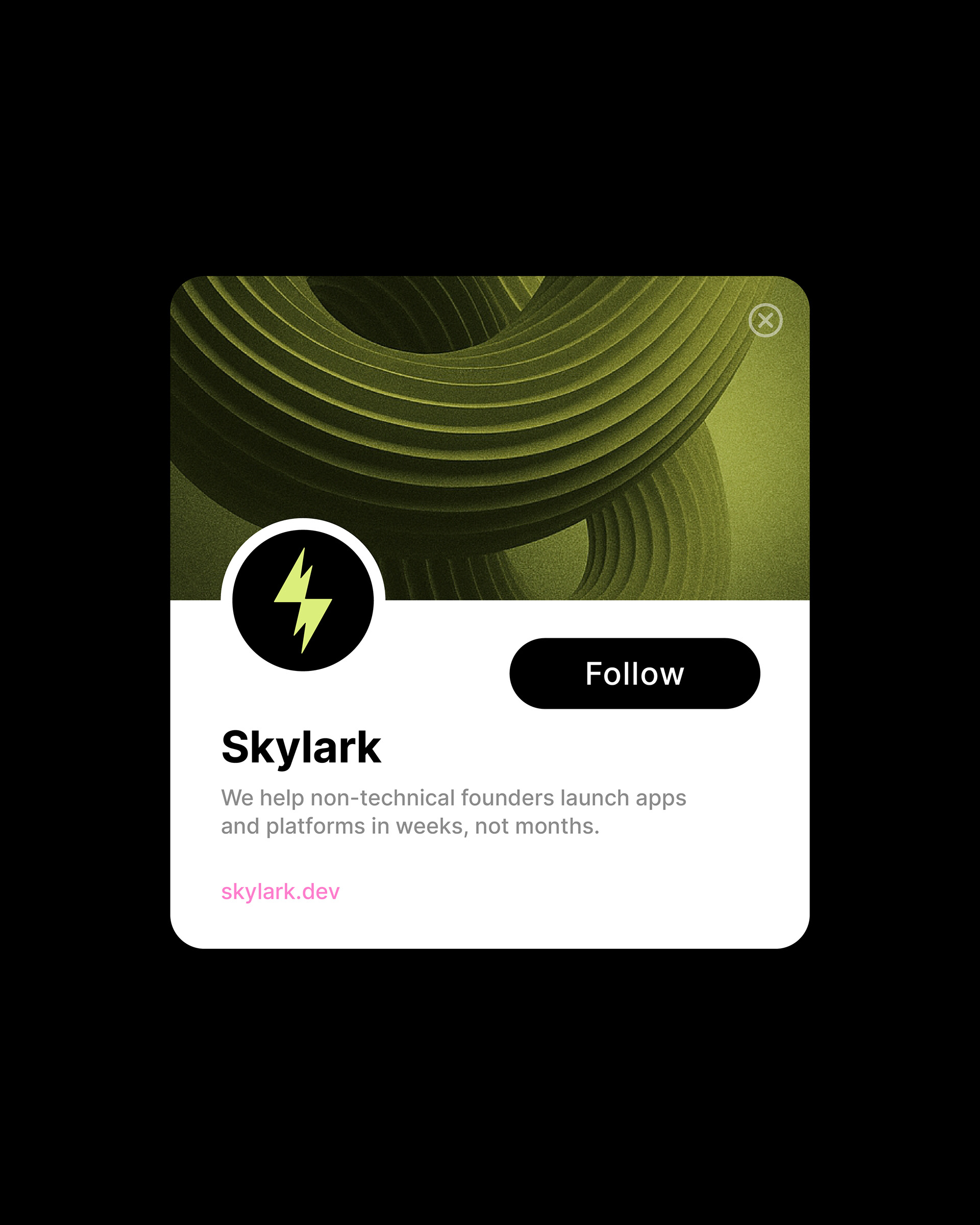
Skylark.dev is a development studio based in Amsterdam that helps non-technical founders launch their digital product ideas—fast. Think MVPs, fast iterations, AI-powered tools, and the kind of scrappy brilliance that turns napkin sketches into market-ready platforms. Their name, inspired by the skylark bird, is all about lifting ideas off the ground. So we knew the brand identity had to fly high—while staying sharp, modern, and professional.
Steven, their co-founder and CEO, was incredibly open and trusting throughout the process. The entire team is sharp, thoughtful, and genuinely great to collaborate with.
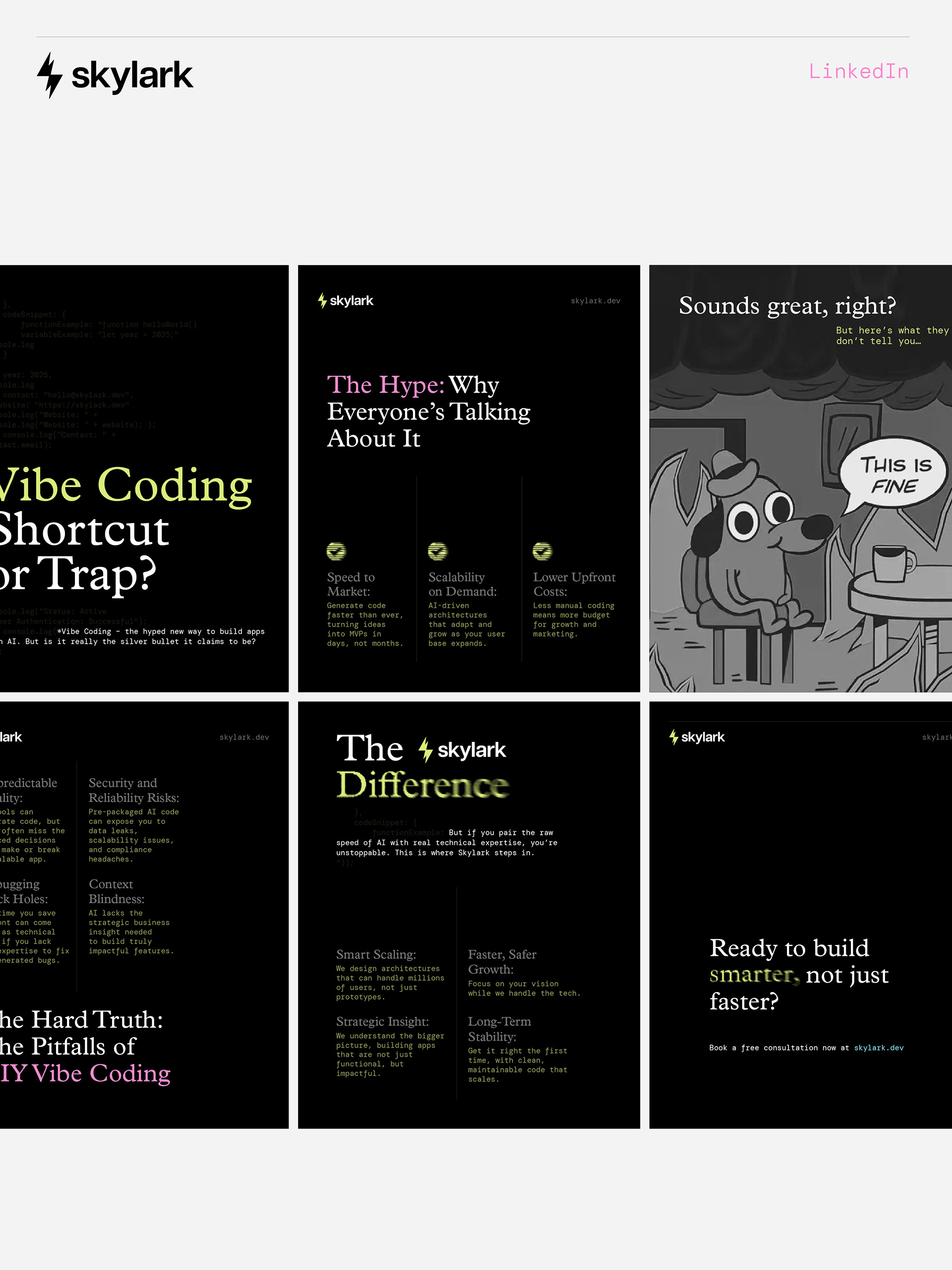
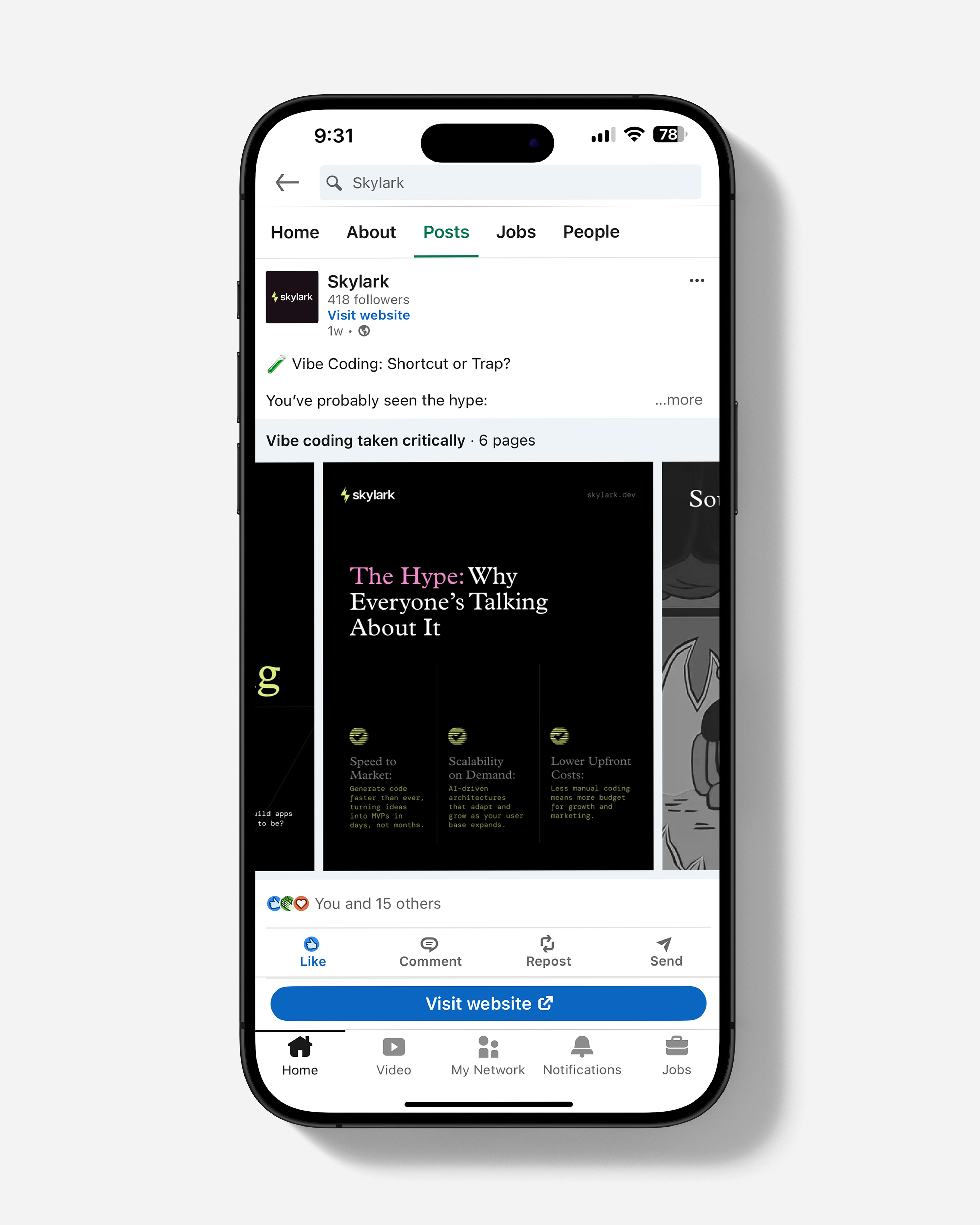
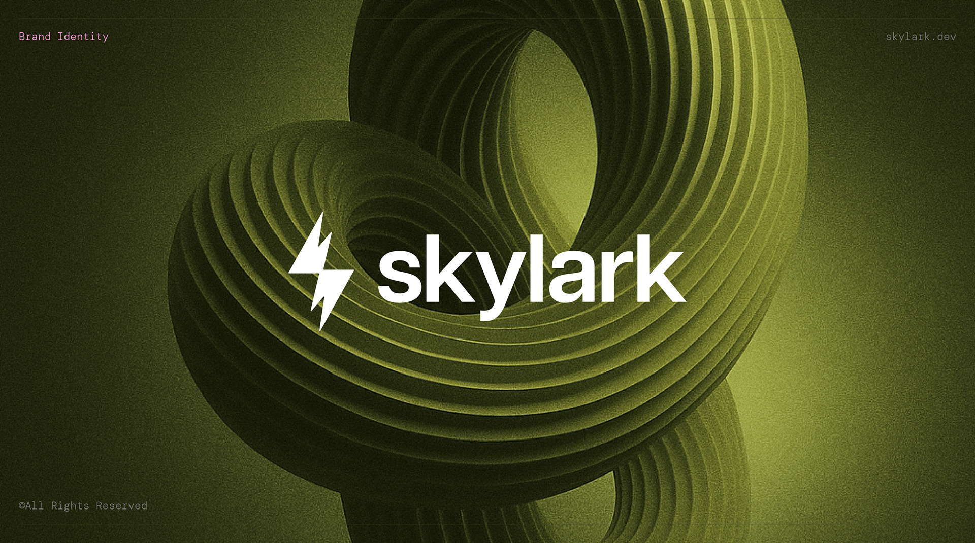
Building a Brand That Moves
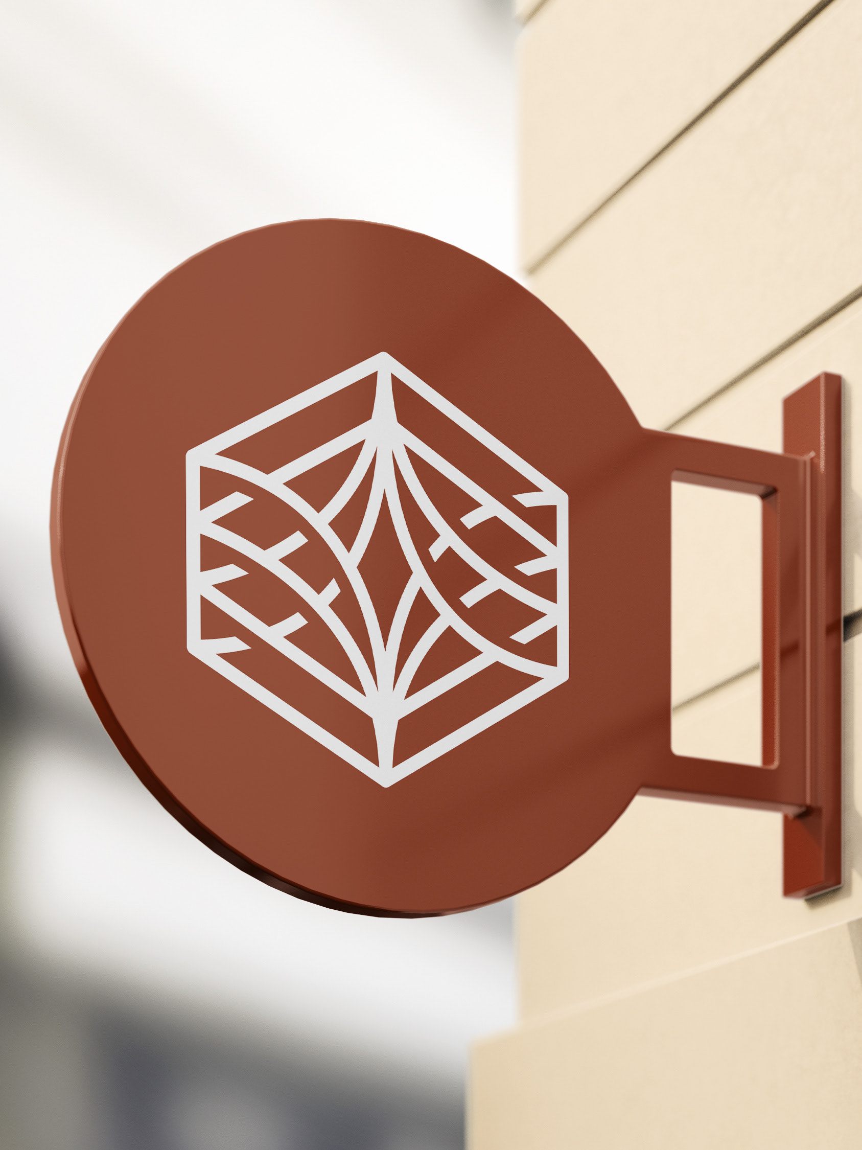
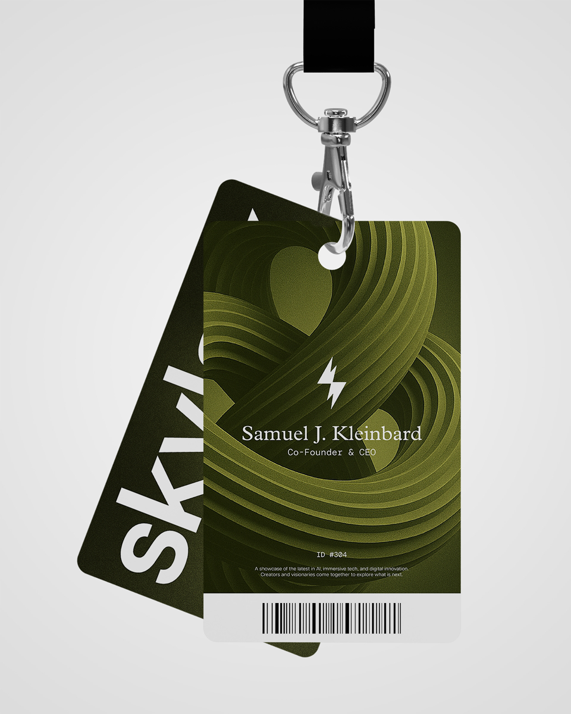
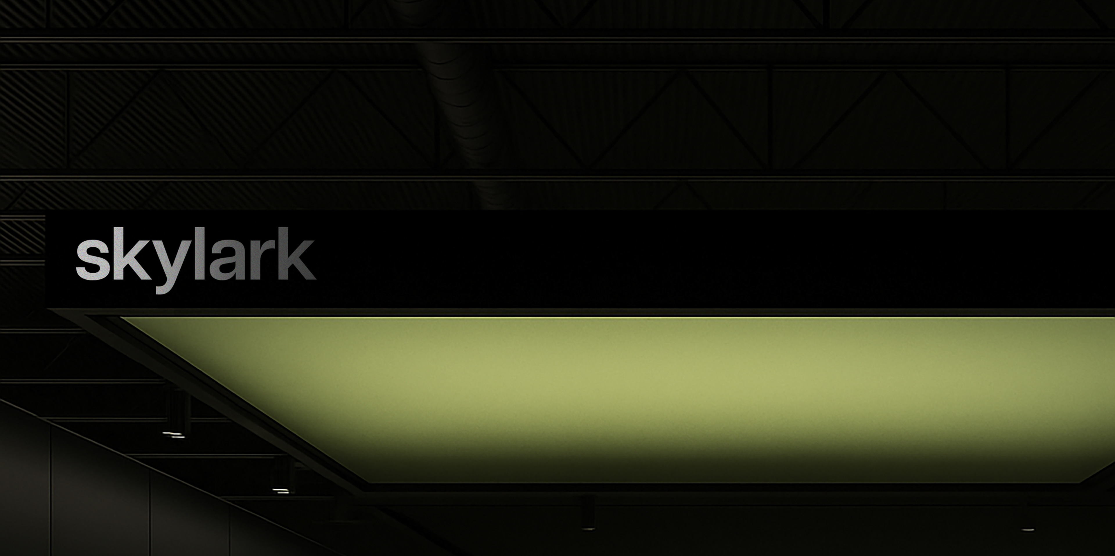
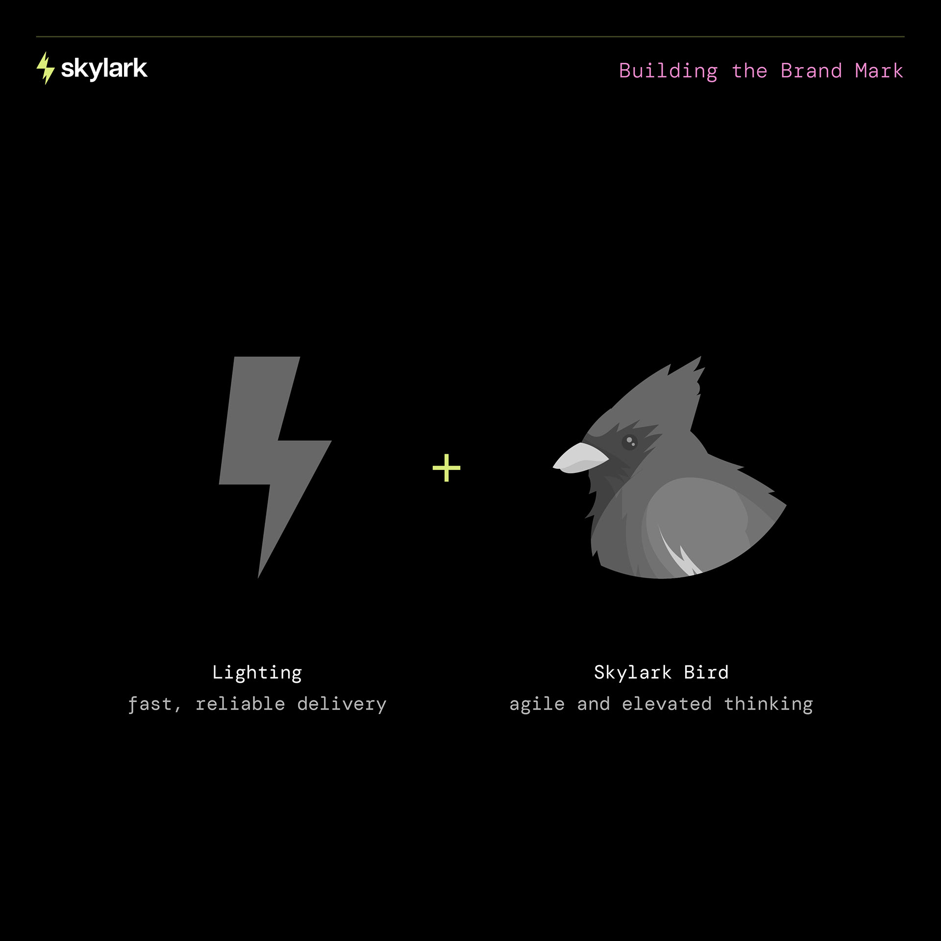
Skylark’s north star was speed—but not just any speed. Smart, intentional, professional speed. That insight steered us away from literal bird imagery (too on the nose) and toward something more abstract: a shape that captures momentum. The final brand mark is inspired by a lightning bolt and the streamlined head of a skylark, angled upward to suggest takeoff and progress. It’s dynamic but minimal, fast but grounded.
Typography-wise, we went with a combination of Articulat CF, Plantin MT Pro, and DM Mono—each bringing something different to the table. Articulat gives us that clean, modern tech feel. Plantin adds warmth and legacy, grounding the brand in trust. And DM Mono gives the whole thing a little developer DNA—because Skylark is, at the end of the day, a builder’s studio.


5 Primary Colors. 40 More to Play With.
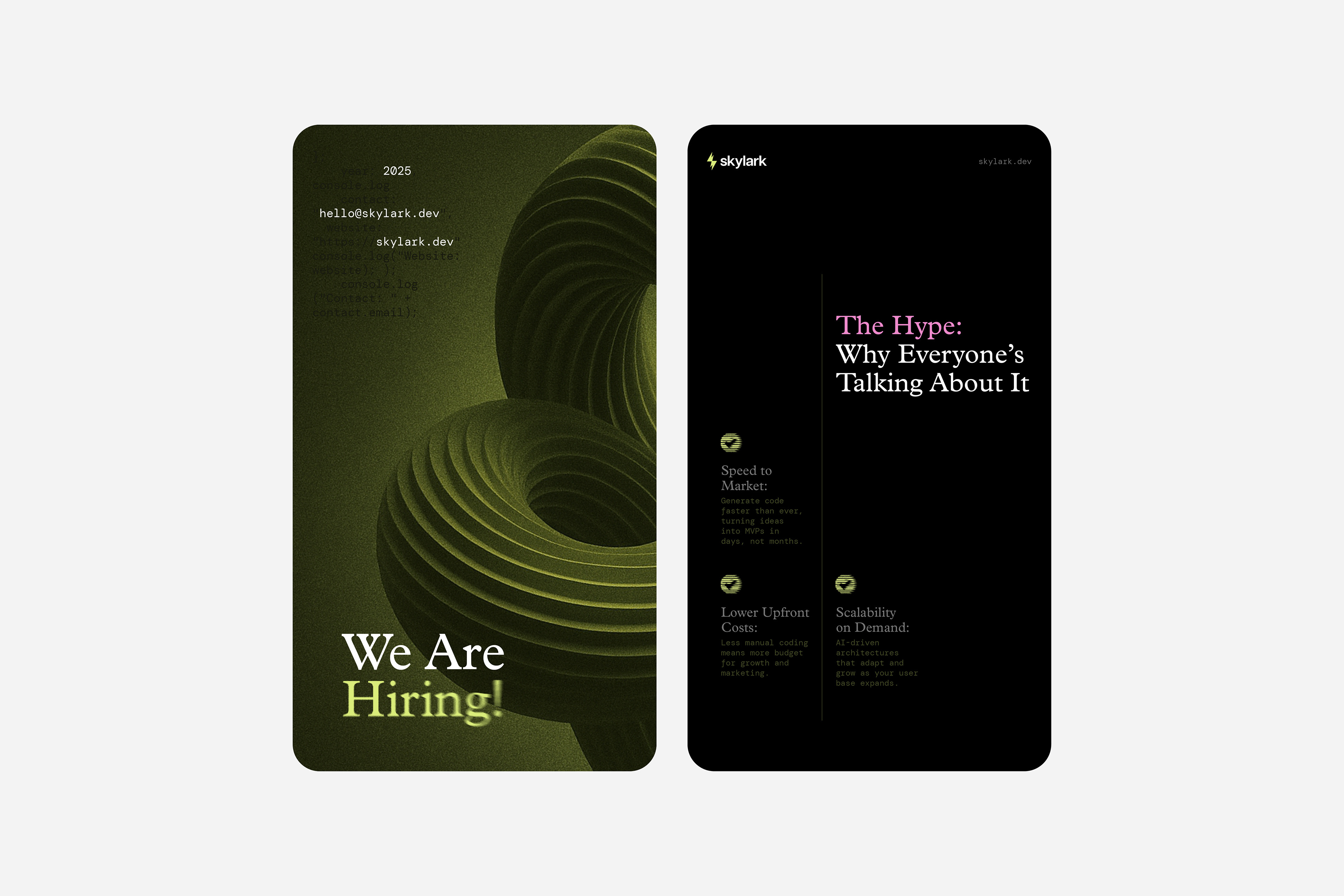
We usually stick to a tighter color system, but with Skylark, we went big. Five primary colors (Skylark Lime, Contrast Gray, Orbit Violet, Accent Blue, and Accent Pink) and a supporting palette of 40 complementary shades. Yes, forty. We spent a ridiculous amount of time fine-tuning hues, but it was so worth it. The colors work beautifully across digital applications, especially when used over black—which is the base tone for most of Skylark’s materials. The result? A brand that feels alive and flexible, but always cohesive.

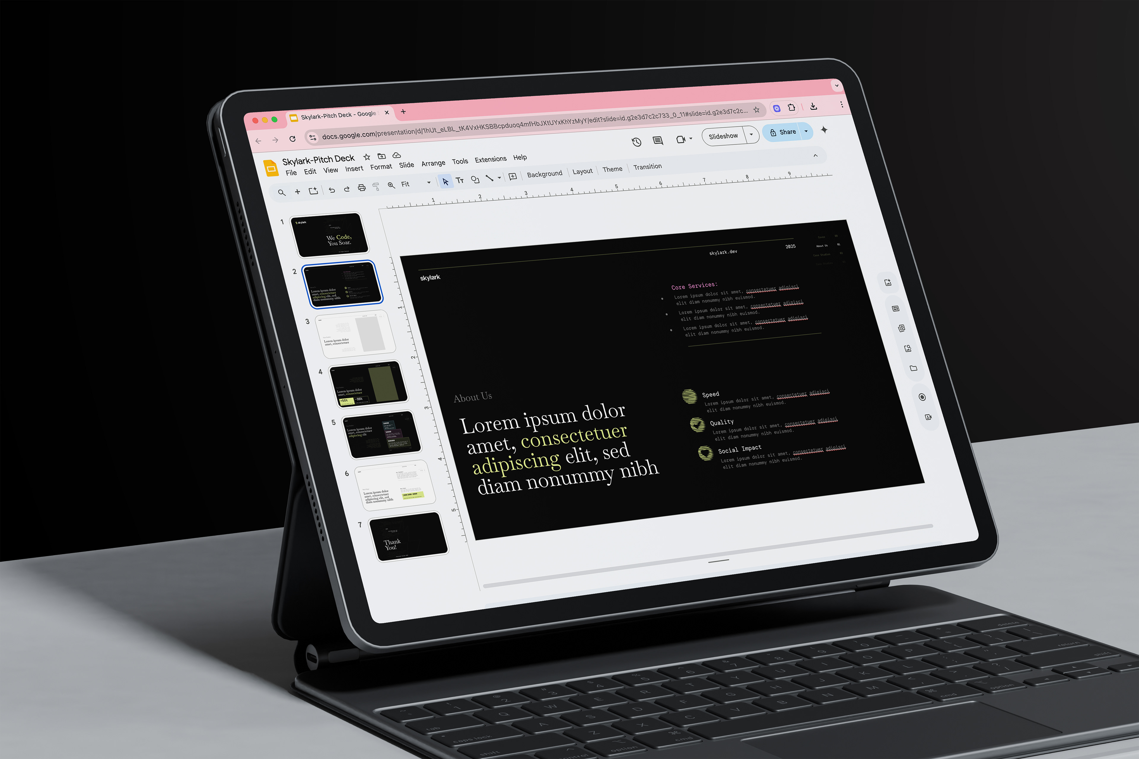
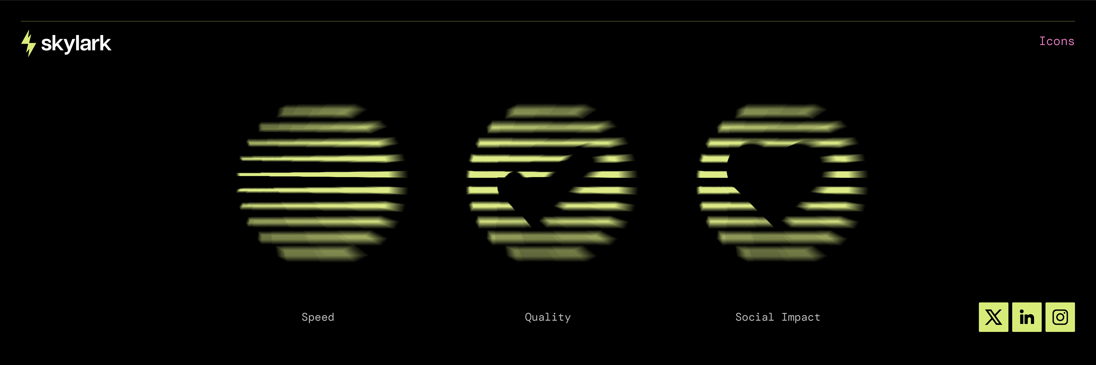
Icons, Templates, and the Joy of Seeing It All Come Together
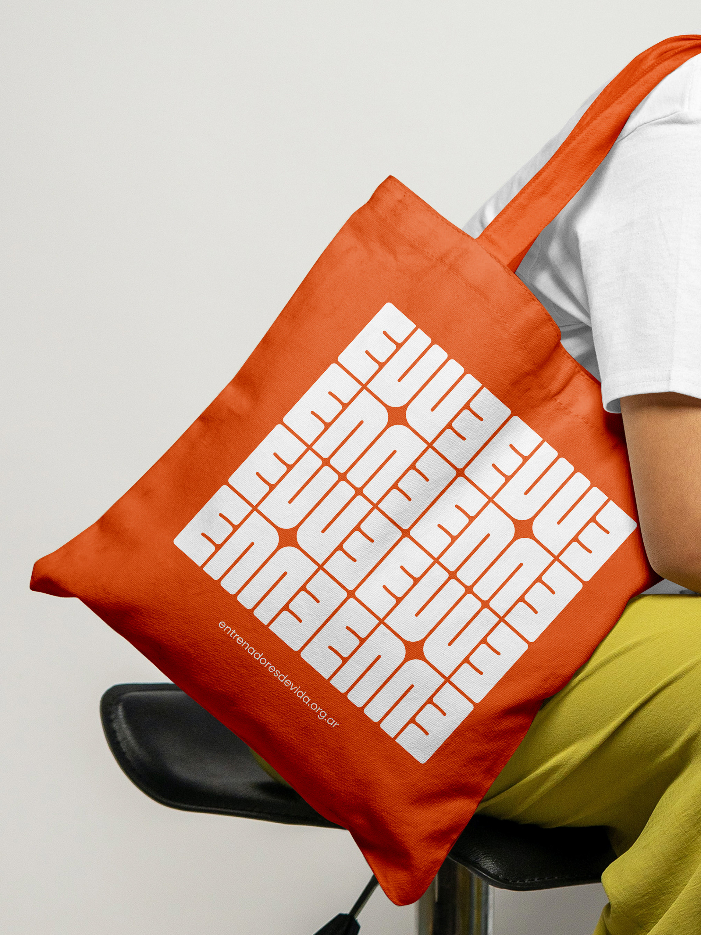
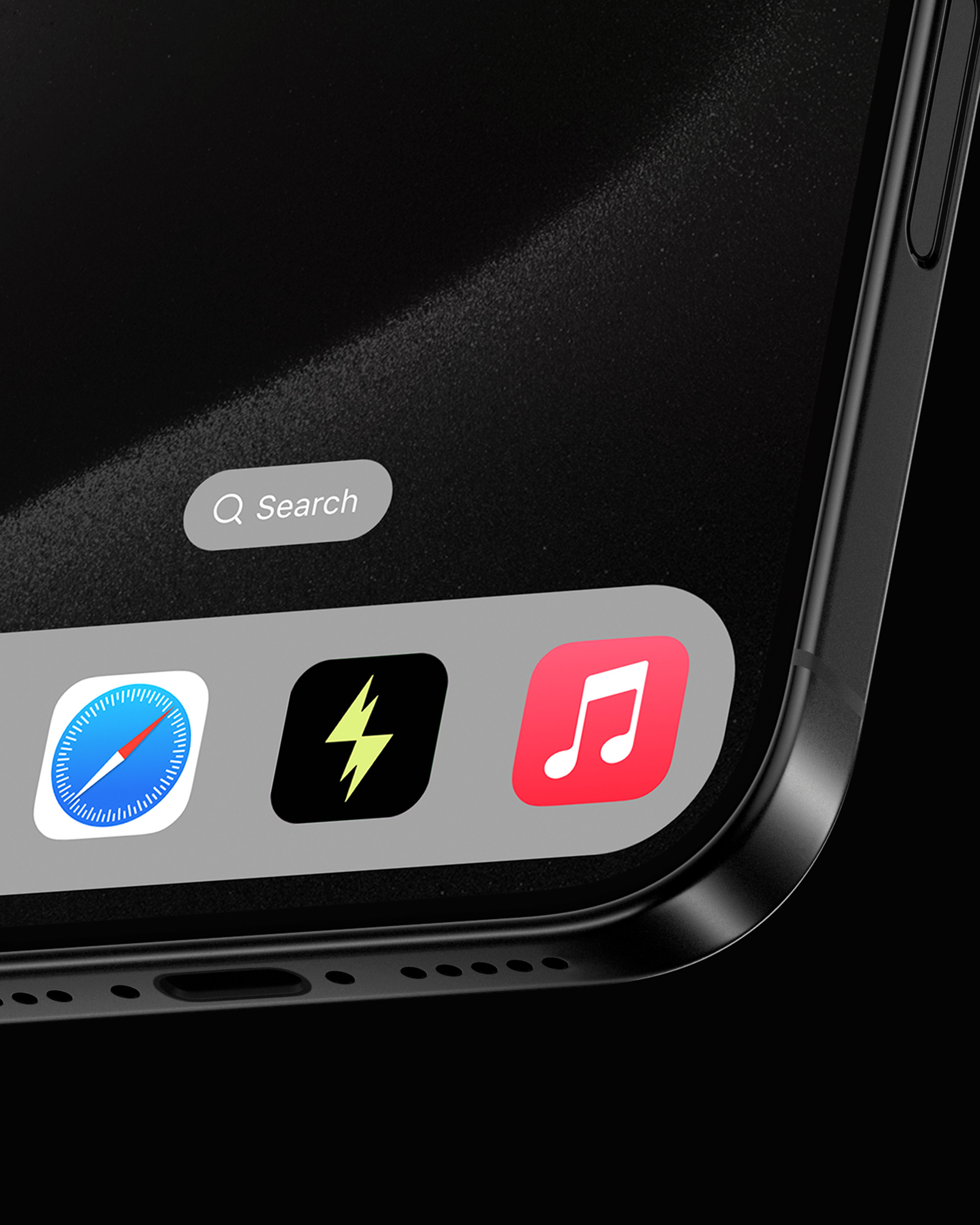
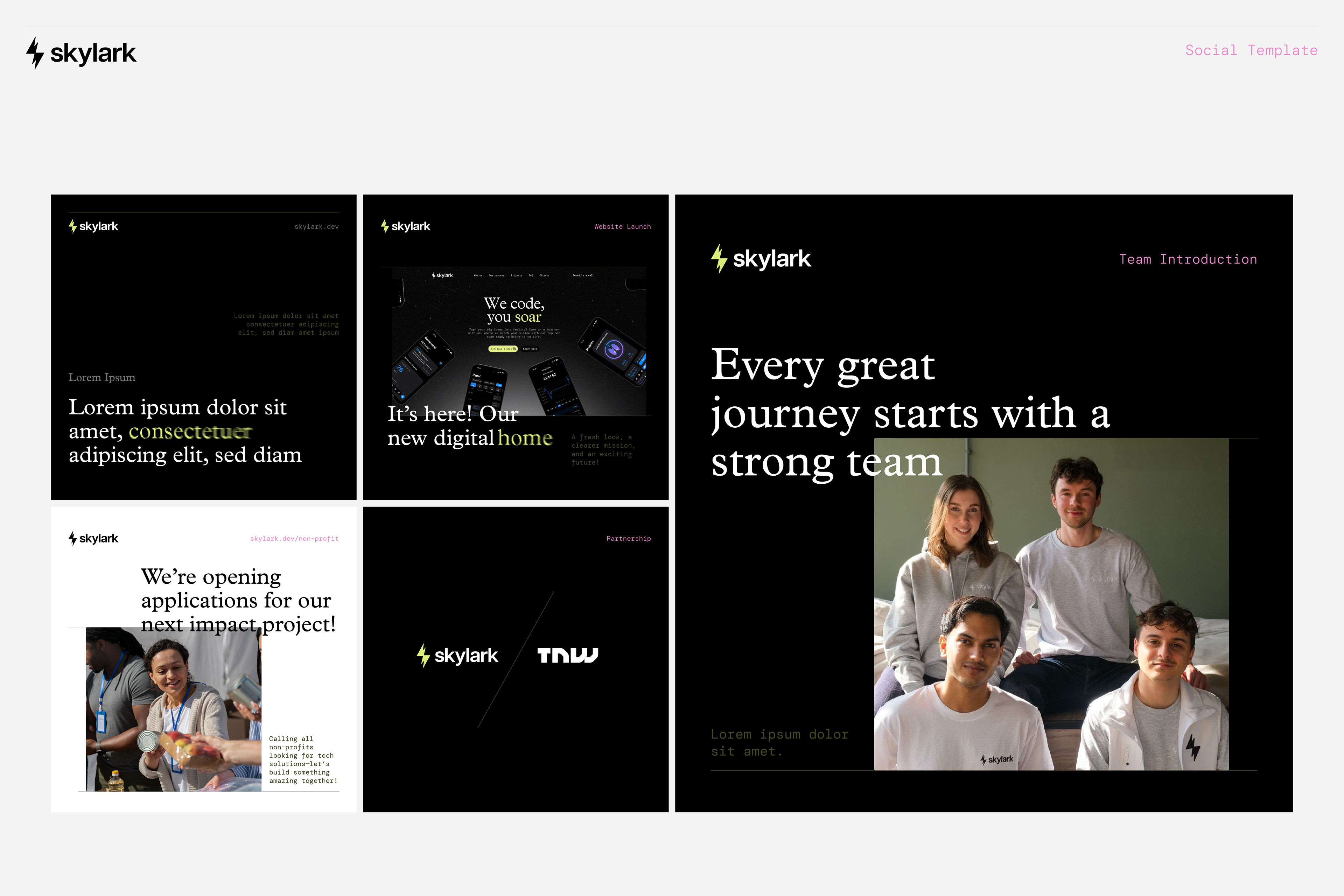
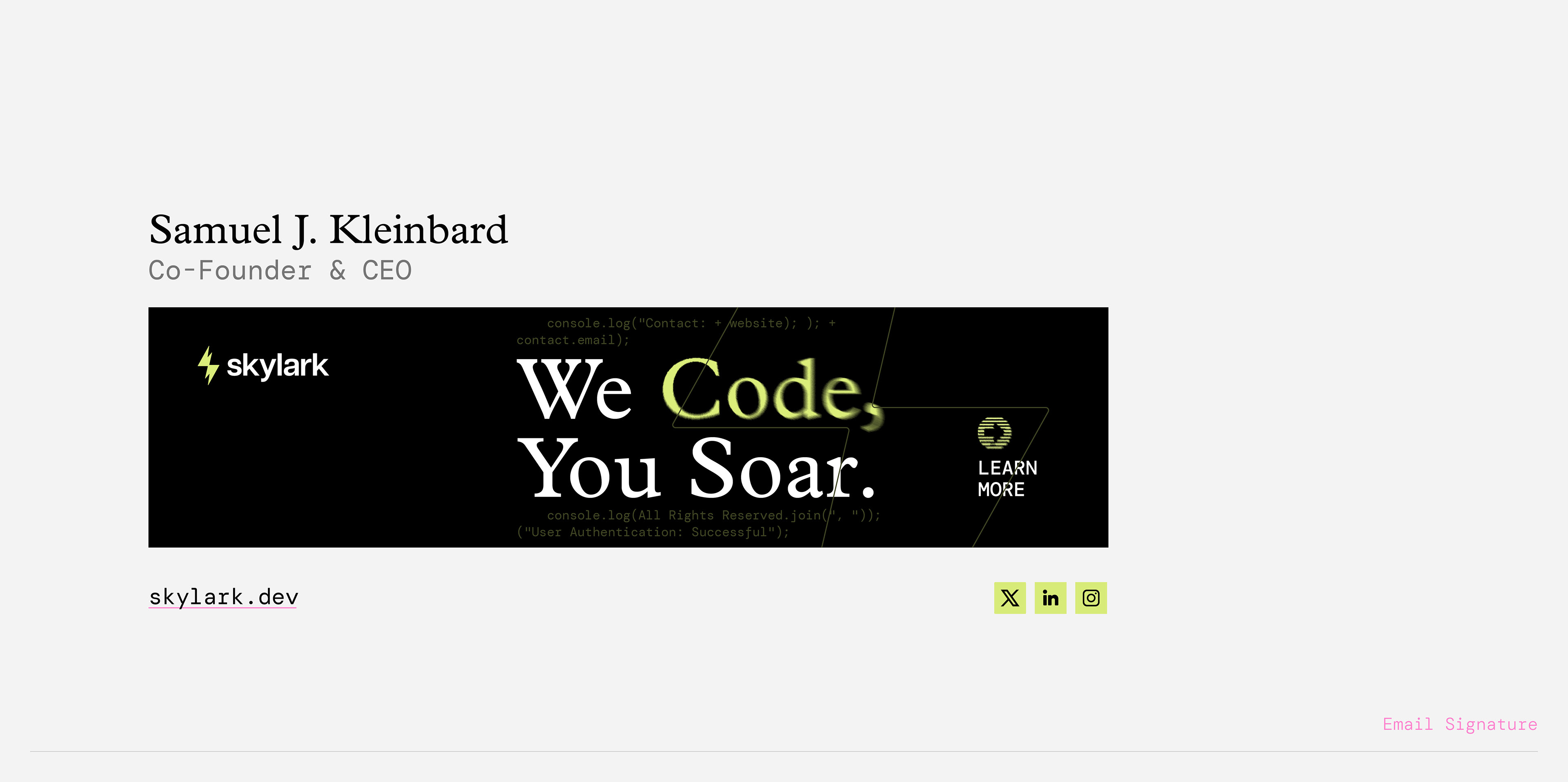
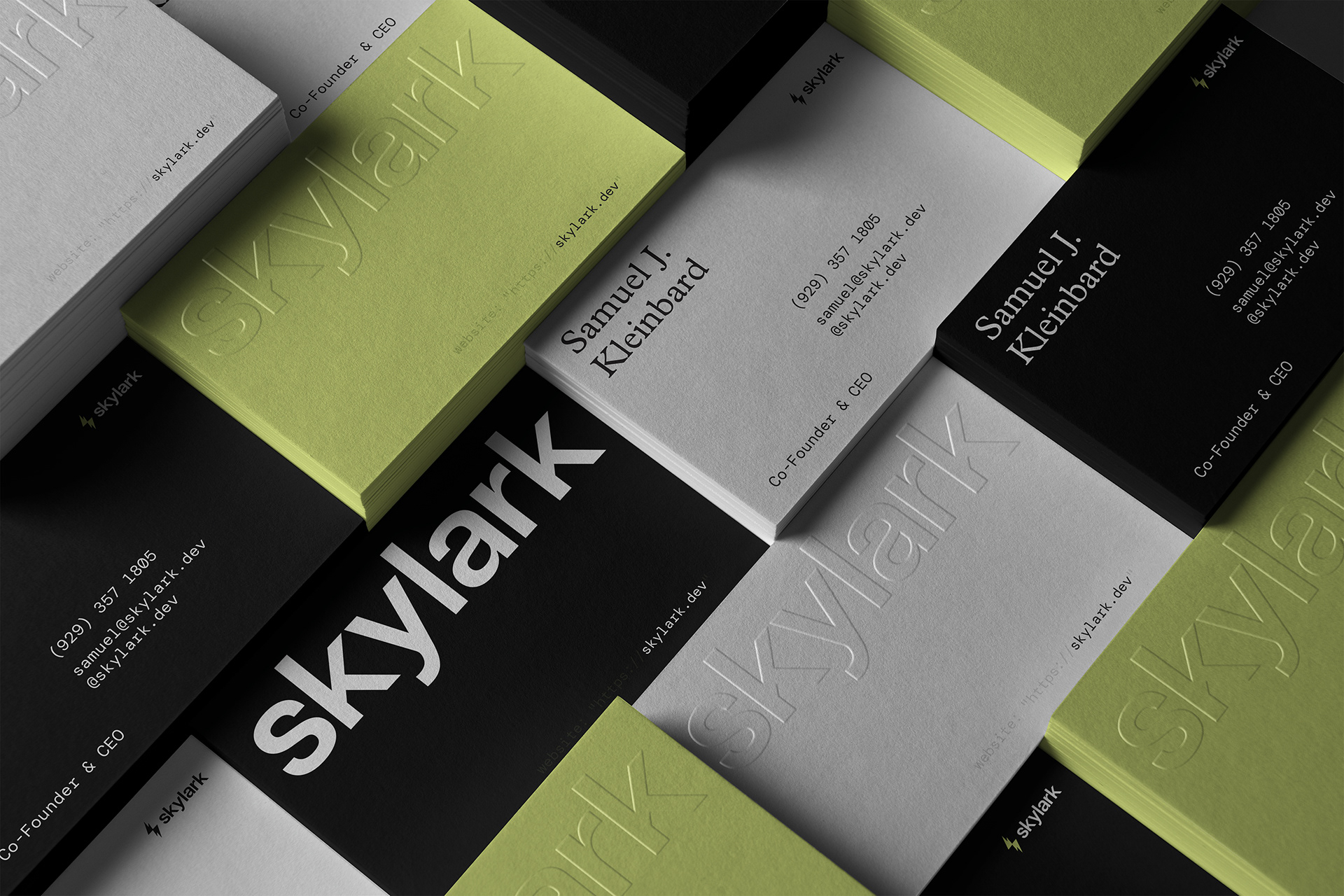
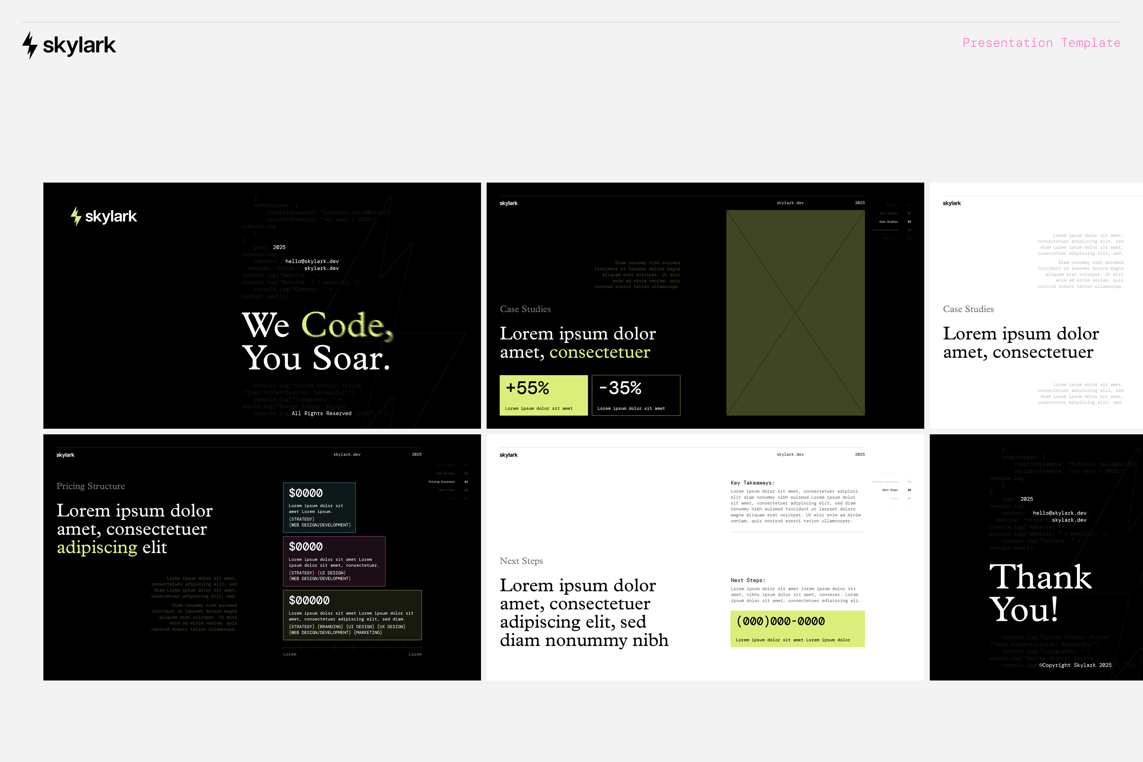
In addition to the core identity, we designed social templates, email signatures, presentation decks (Google Slides + PowerPoint), a stationery system, and a growing icon set. The icons focus on speed—with a unique blur effect that gives them motion and distinction. Everything was crafted to feel like part of the same world. The kind of system where you can drop anything in and it just works.
Honestly, we don’t always get the chance to go this deep with clients—but Skylark let us go all in. Their openness, vision, and collaboration made this one of those dream projects where every decision gets the attention it deserves. We’re still working together, and it is exciting to see the brand grow in real time as new materials roll out.
Purpose-Driven Tech With Real Impact
One last thing we love about Skylark: they do more than build MVPs for startups. They recently partnered with the Neurodiversity Foundation to build assistive tech for neurodivergent communities—offering their work pro bono. For them, technology is a bridge, not a product. That mission deeply resonated with us.
There is something really energizing about building a brand for a company that moves fast, thinks deeply, and leads with heart. Skylark isn’t just another dev studio—they’re designing the future with empathy and intention. We’re grateful to be part of that flight path.