BeeNatu+ isn't your average honey brand. They're shaking things up in the industry with a touch of high-end flair. Here's the inside scoop on crafting a brand identity that's as sweet as their honey itself.
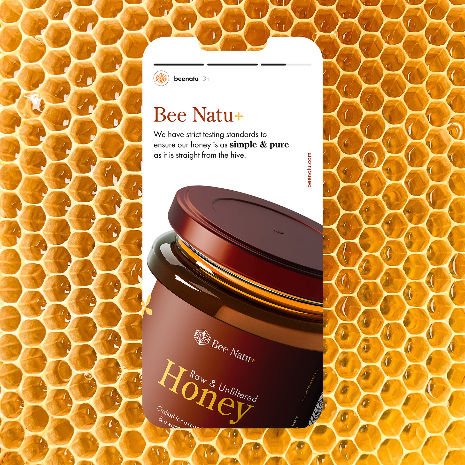
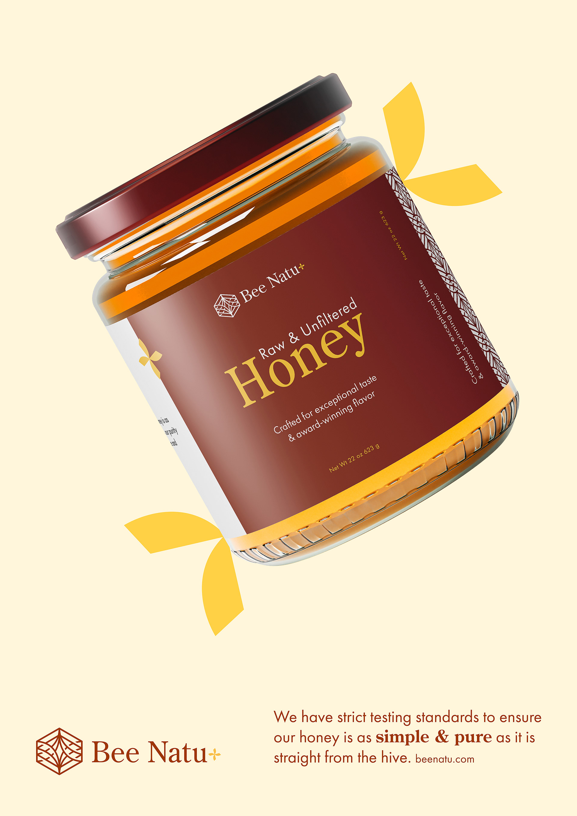
We knew BeeNatu+ deserved a mark that would resonate everywhere, from eye-catching social media posts to sleek packaging that begs to be displayed. Inspiration struck with the honeycomb – a universal symbol of honey, re-imagined with a modern, chic twist. Their honeycomb mark is both instantly recognizable and undeniably cool.
Forget the cliche bright yellows of traditional honey brands. BeeNatu+ exudes a sophisticated air, targeting a discerning audience. That's why we opted for a subtle yet striking color palette. Earthy browns and muted yellows create a sense of elegance that perfectly complements their premium honey.
Taking inspiration from the honeycomb mark, we crafted a series of mesmerizing patterns that can be seamlessly integrated into any platform, from packaging to pitch decks. It's a visual language that adds another layer of depth and recognition to the BeeNatu+ brand.
