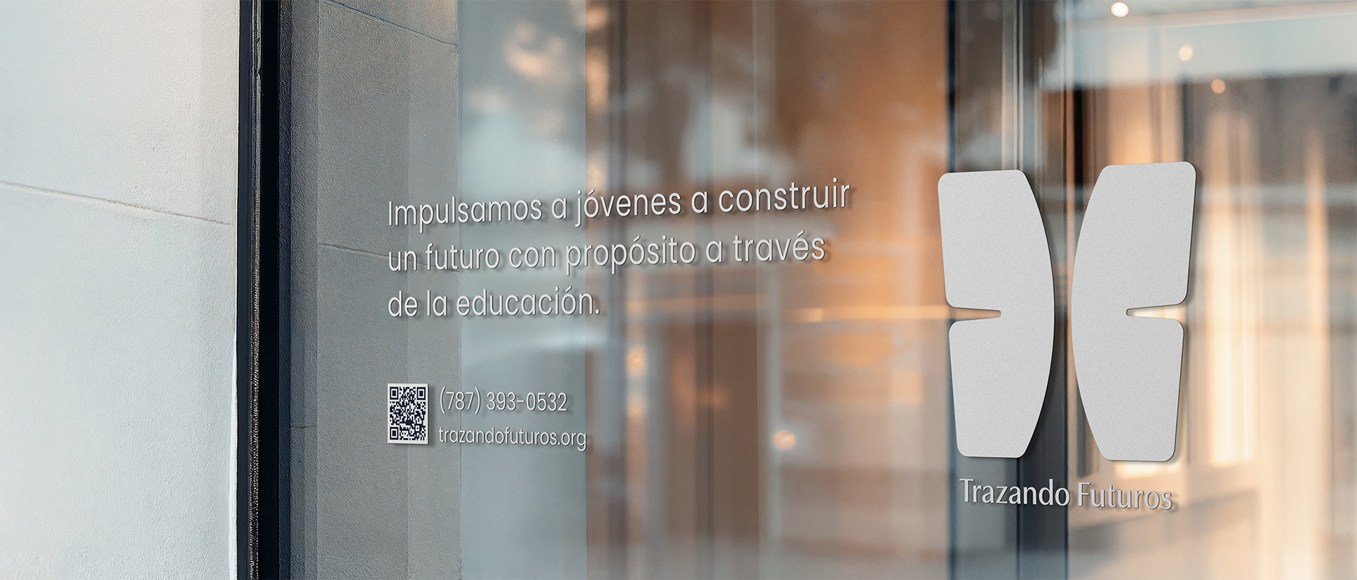
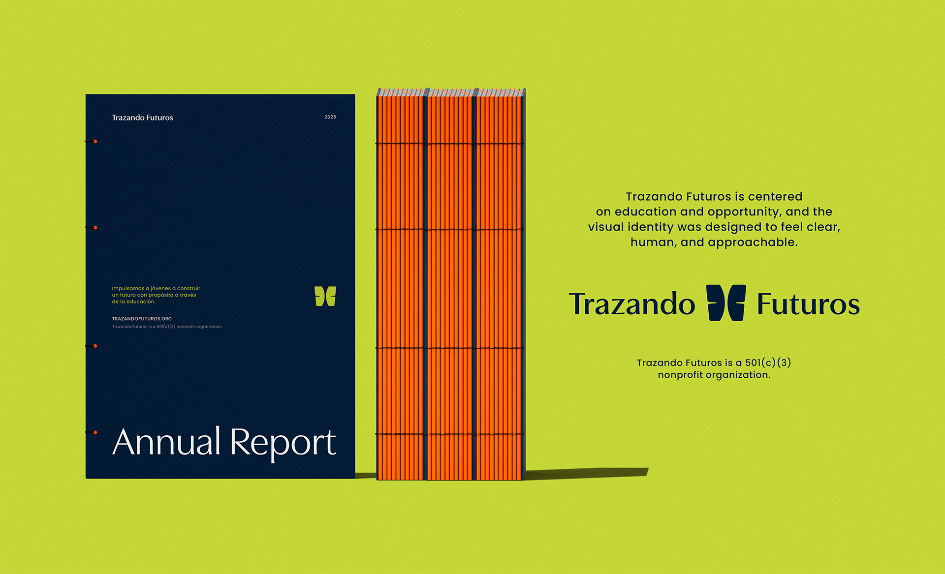
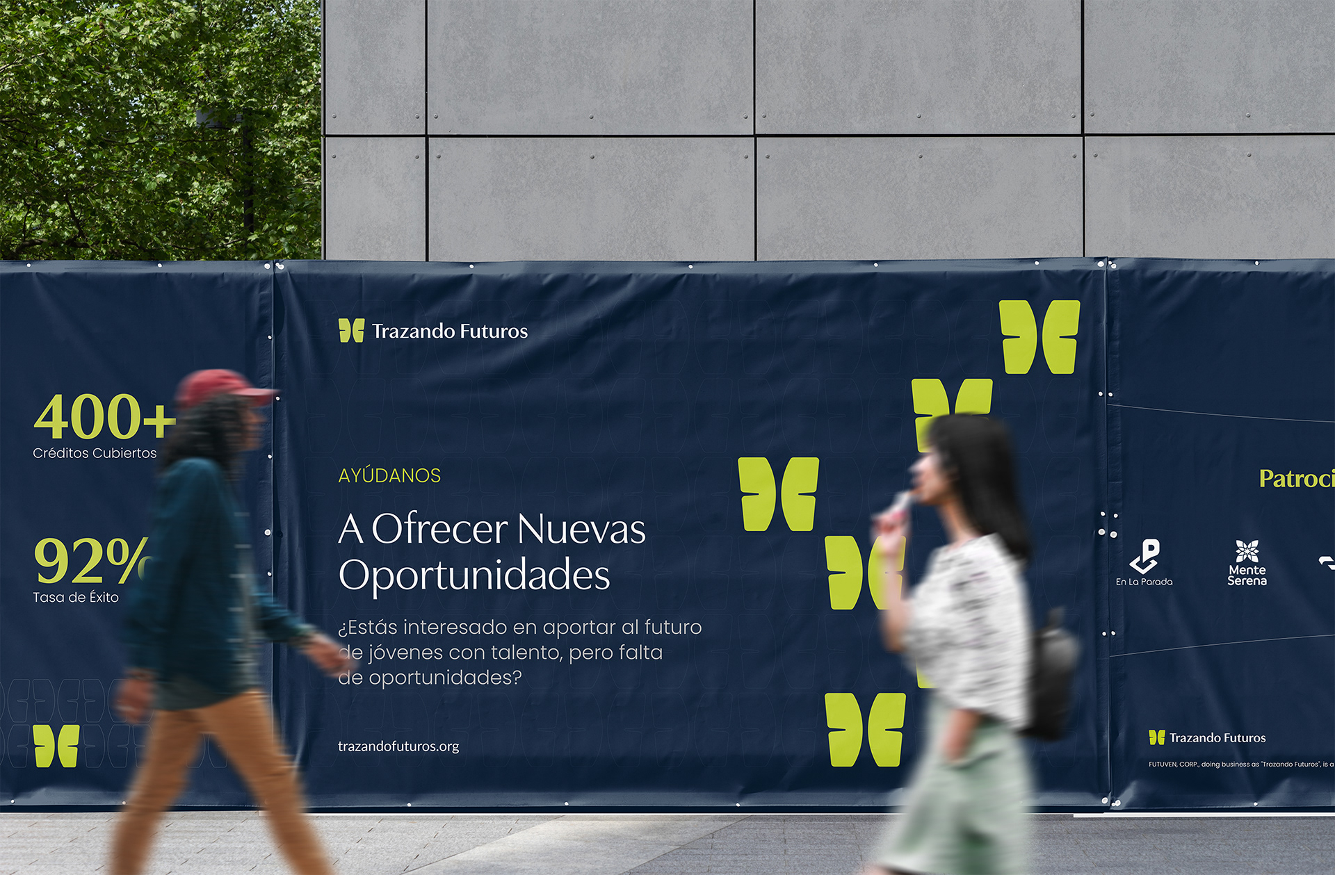
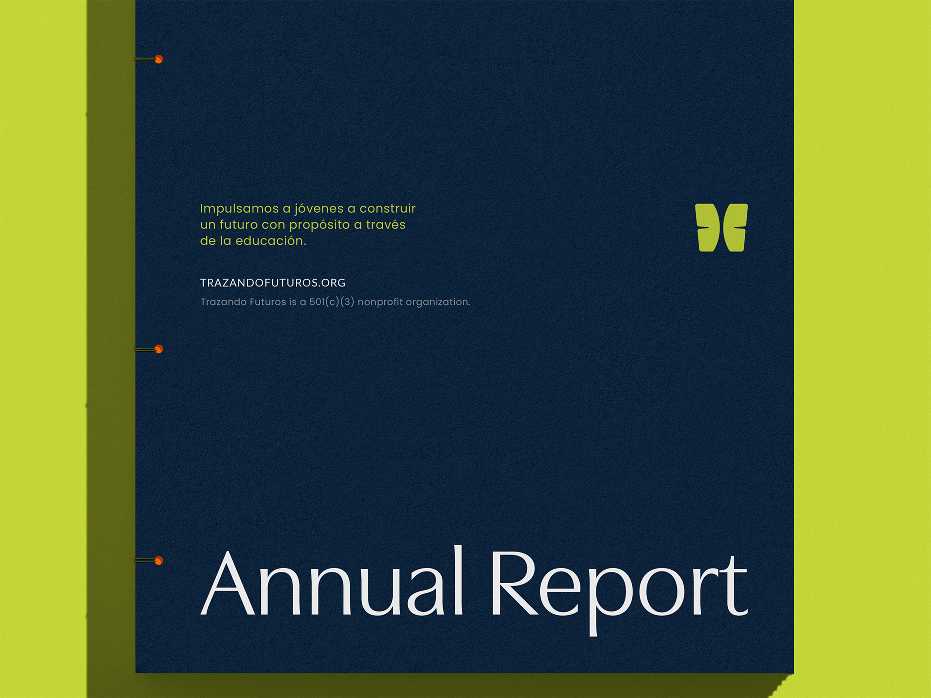
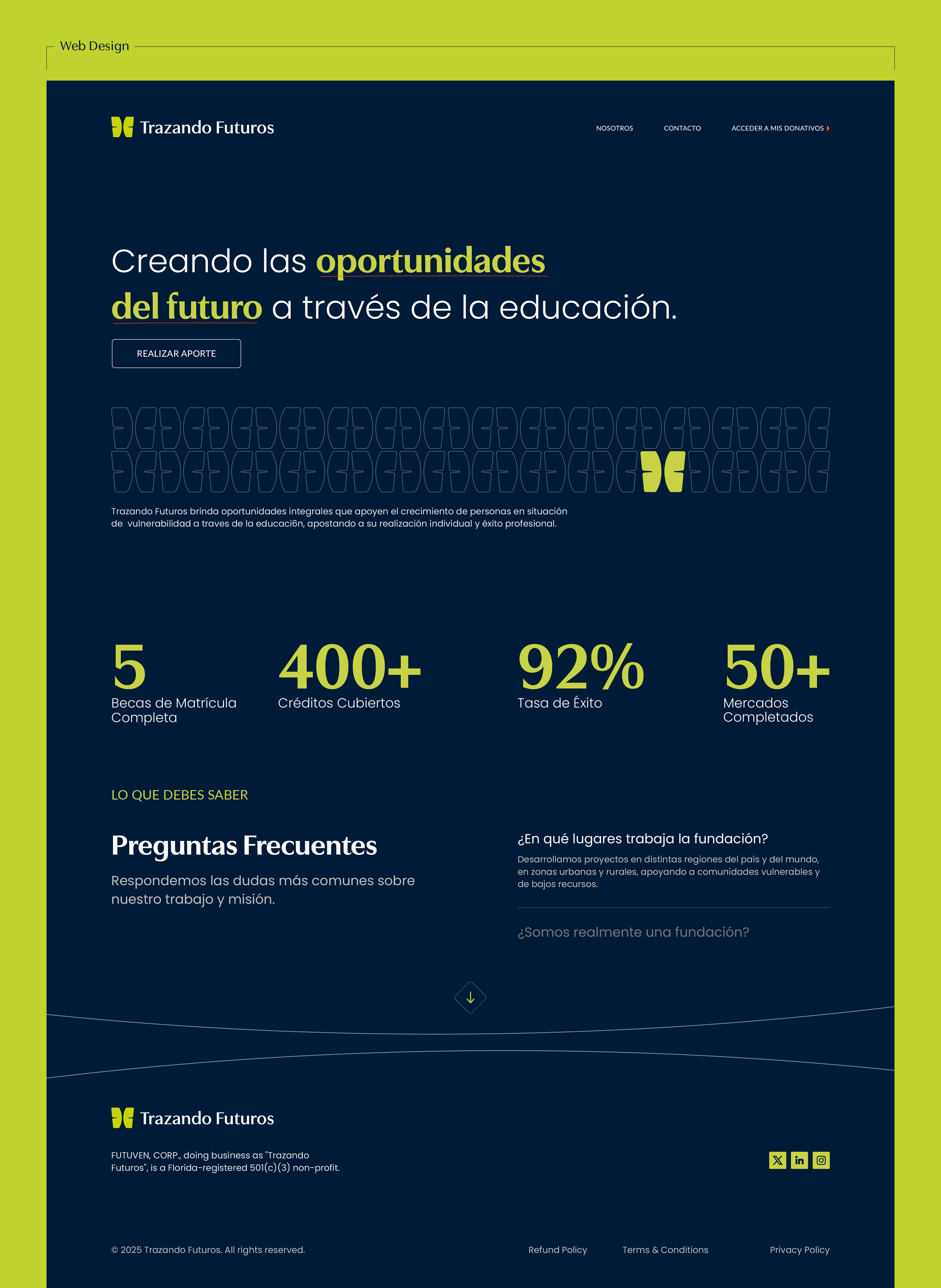
Trazando Futuros is a nonprofit organization focused on developing talent and creating real opportunities for young people in Venezuela. Their work goes beyond scholarships. They support students holistically, covering tuition while also helping with transportation, food, mentoring, psychological support, tutoring, and essential study materials. The goal is long-term independence, employability, and sustainable impact.
Daniel and the team reached out after seeing my previous work with other nonprofit organizations. As they continued to grow, they needed a brand identity that felt more modern, clearer to understand, and easier to apply across different touchpoints. Something that could support their mission today and scale with them tomorrow.
Designing for Growth and Trust
From the beginning, the goal was clear. Build a brand that feels trustworthy for donors while staying approachable and inspiring for students and partners. That balance guided every decision.
I’m especially drawn to projects like this, where a brand needs a real lift. Not just a new look, but a stronger system. One that communicates more clearly, works harder across real scenarios, and supports the people on both sides of the message.
A System Built Around Transformation
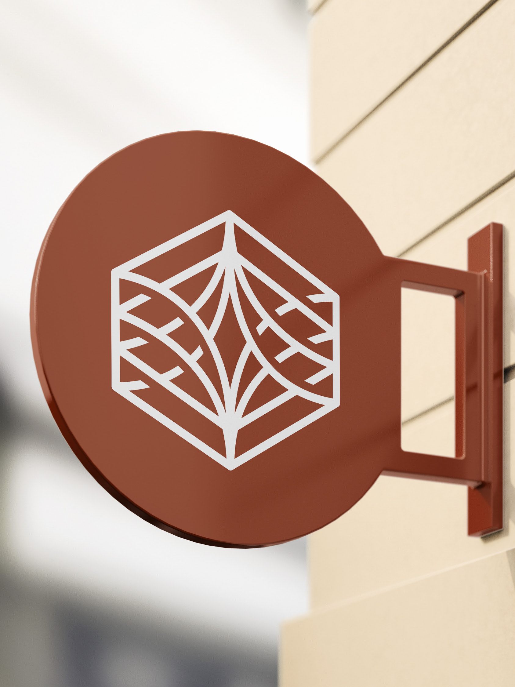
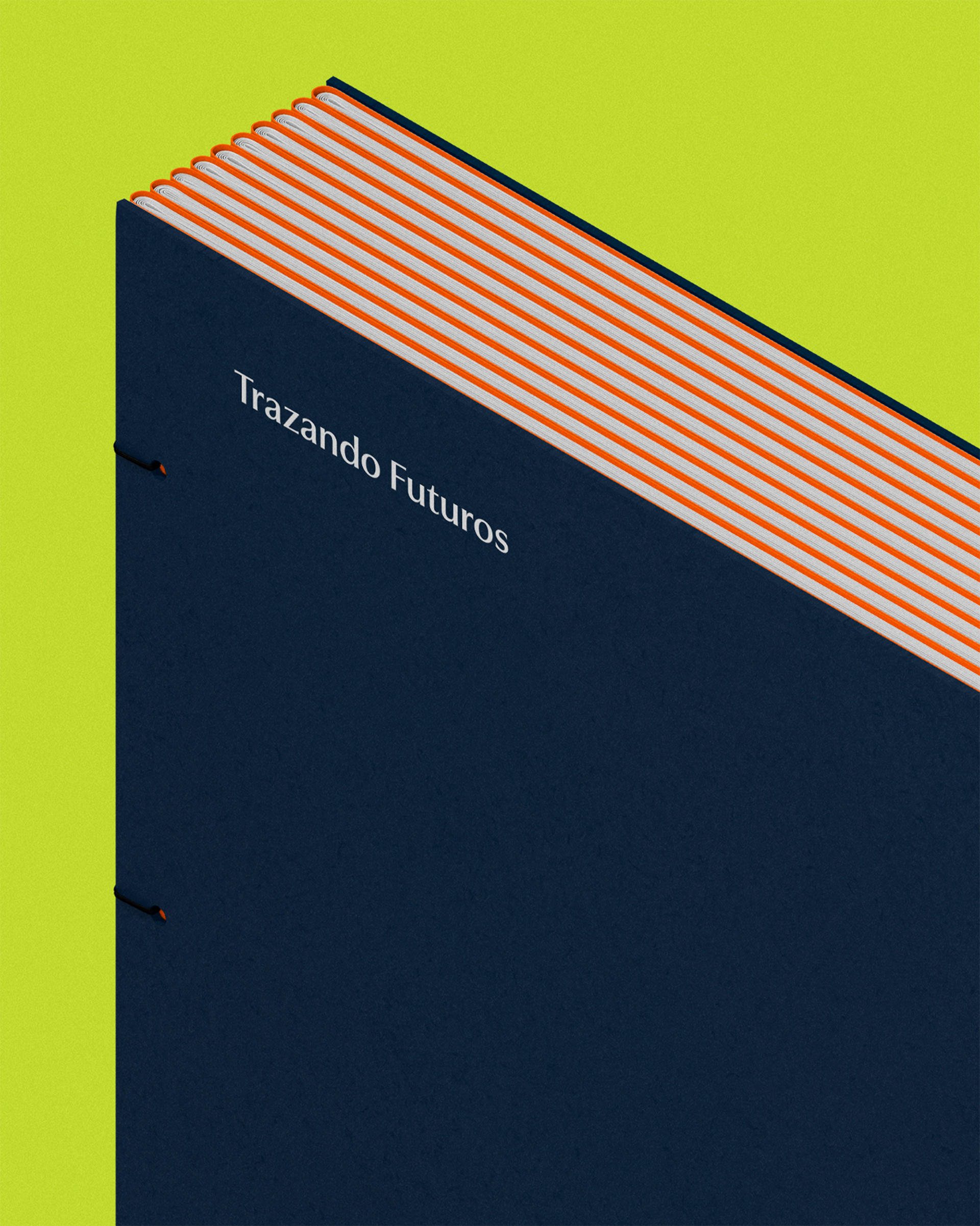
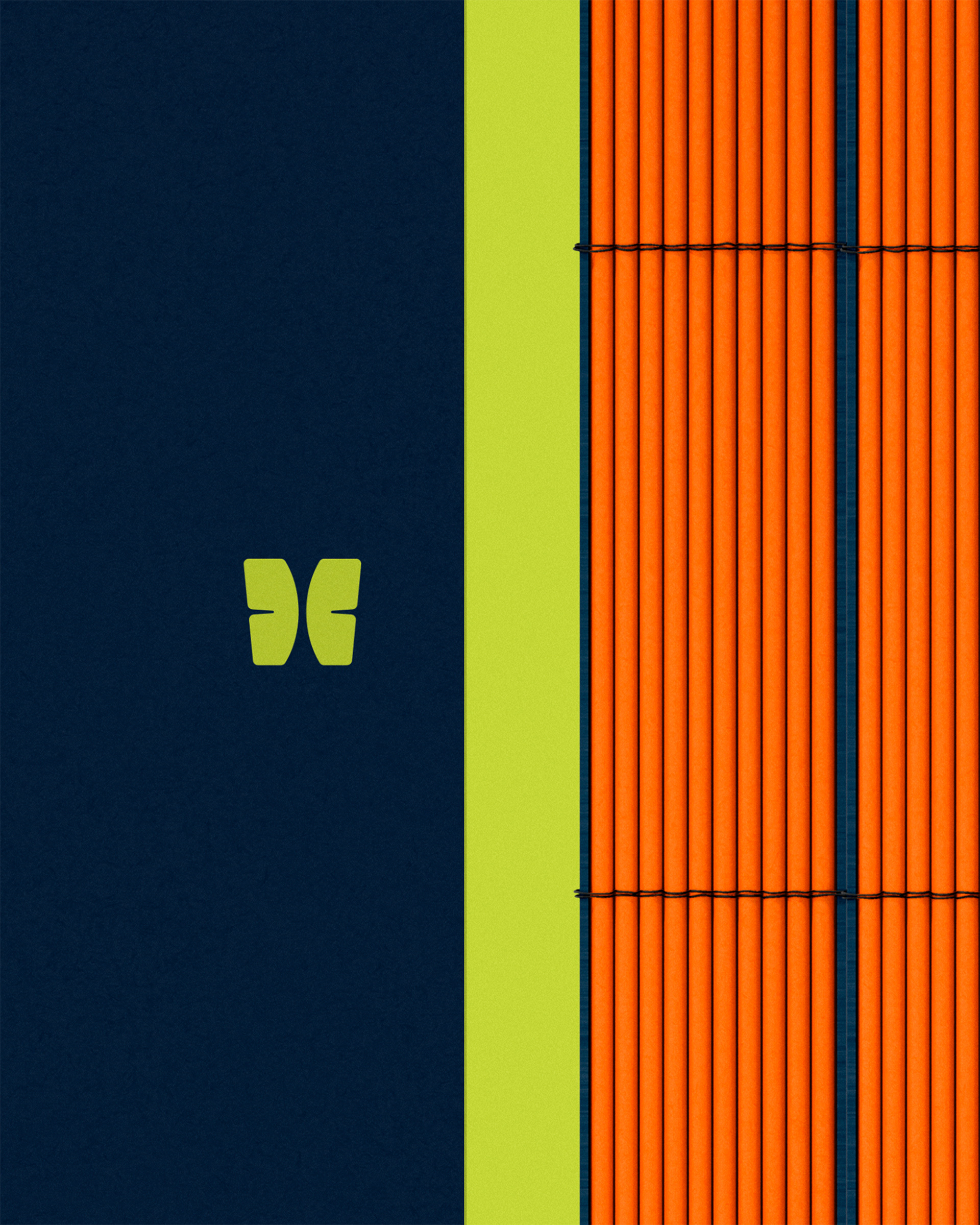
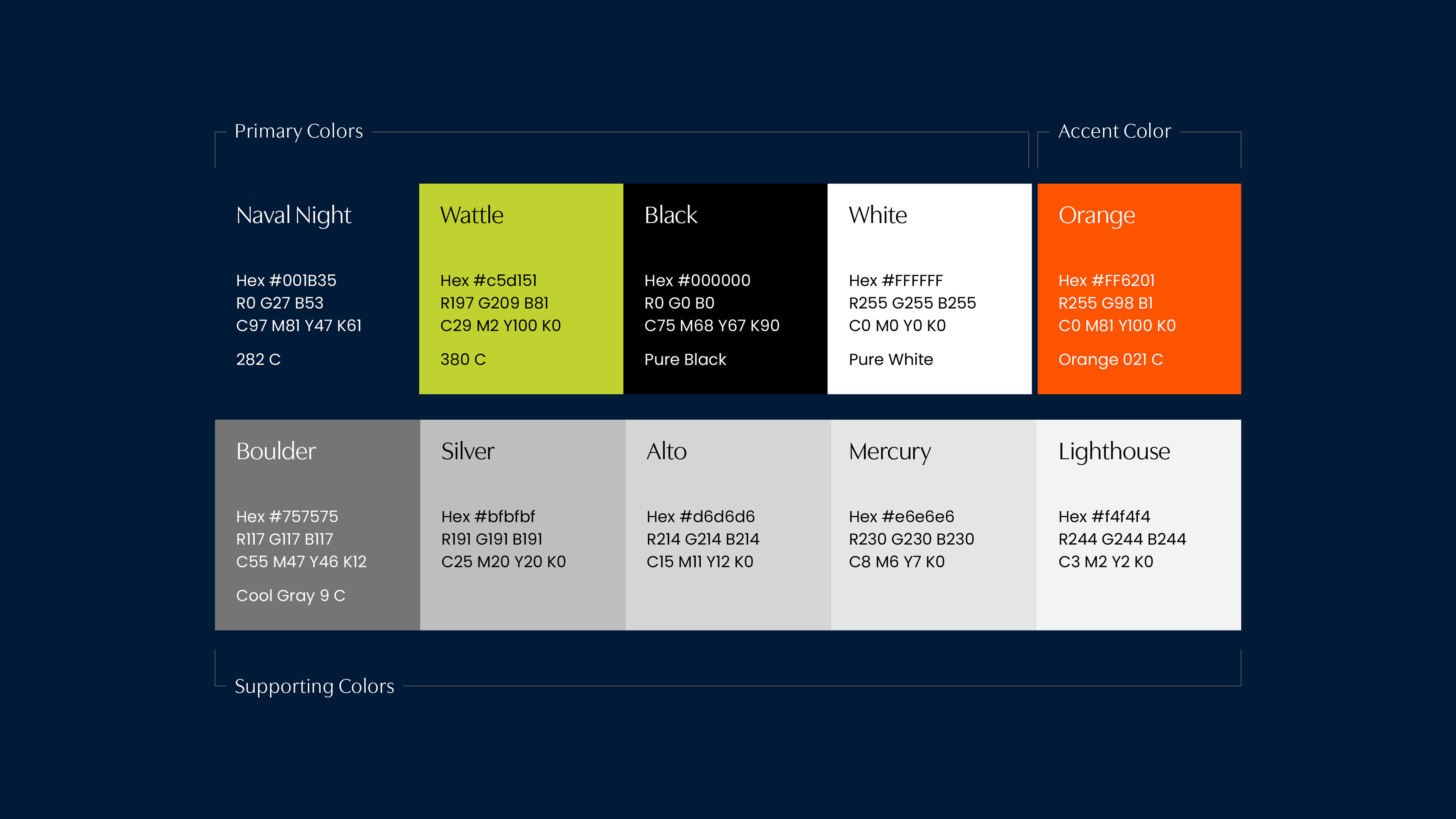
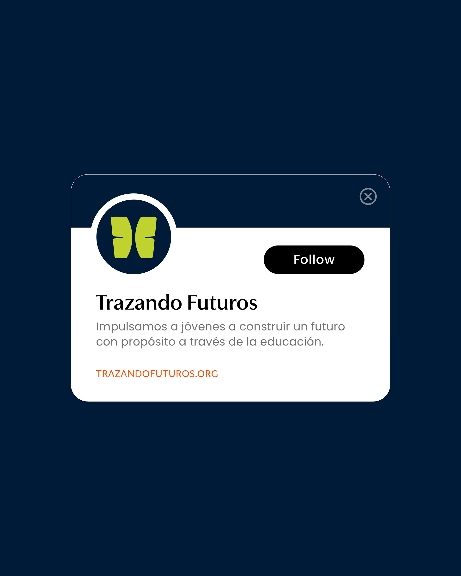
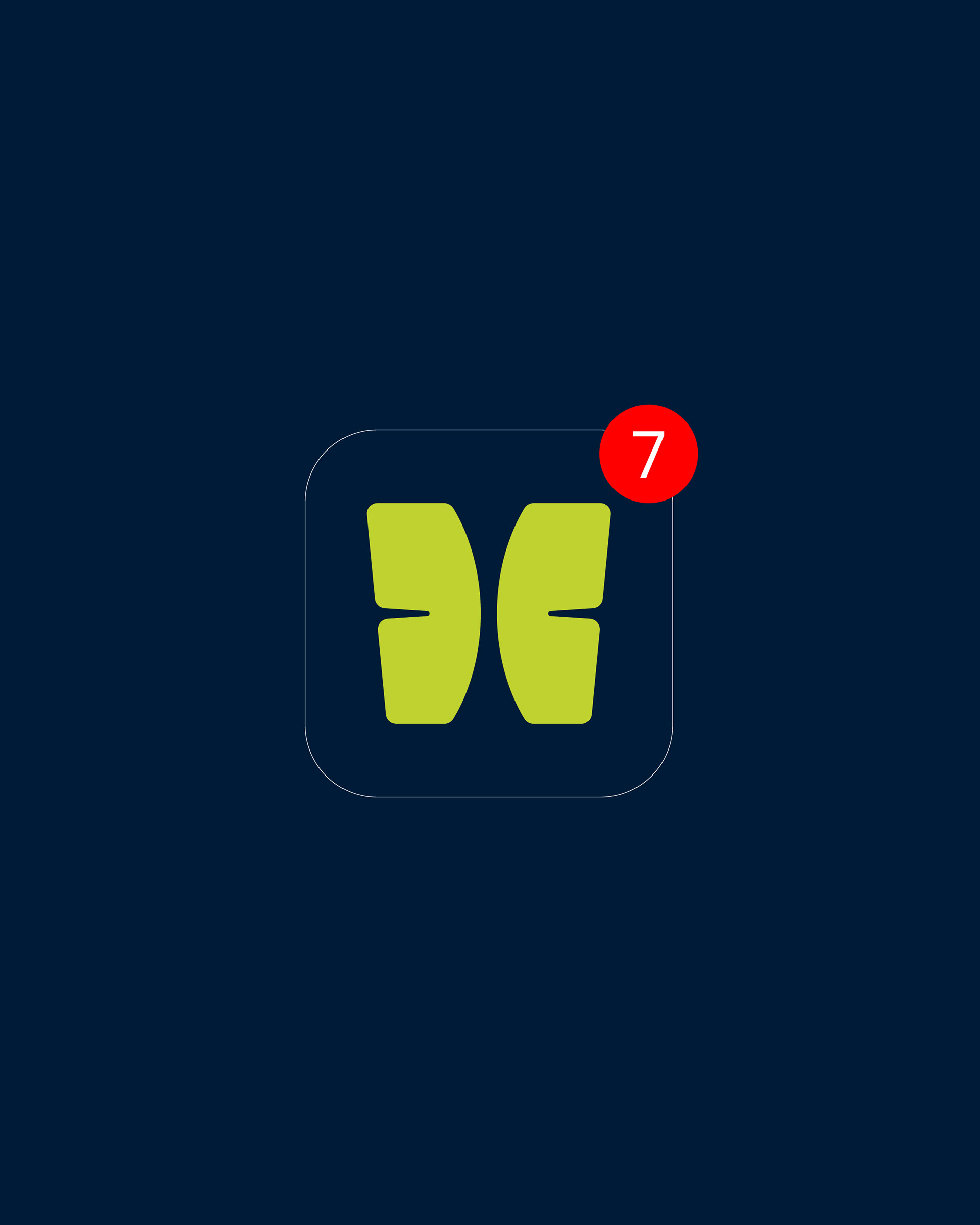
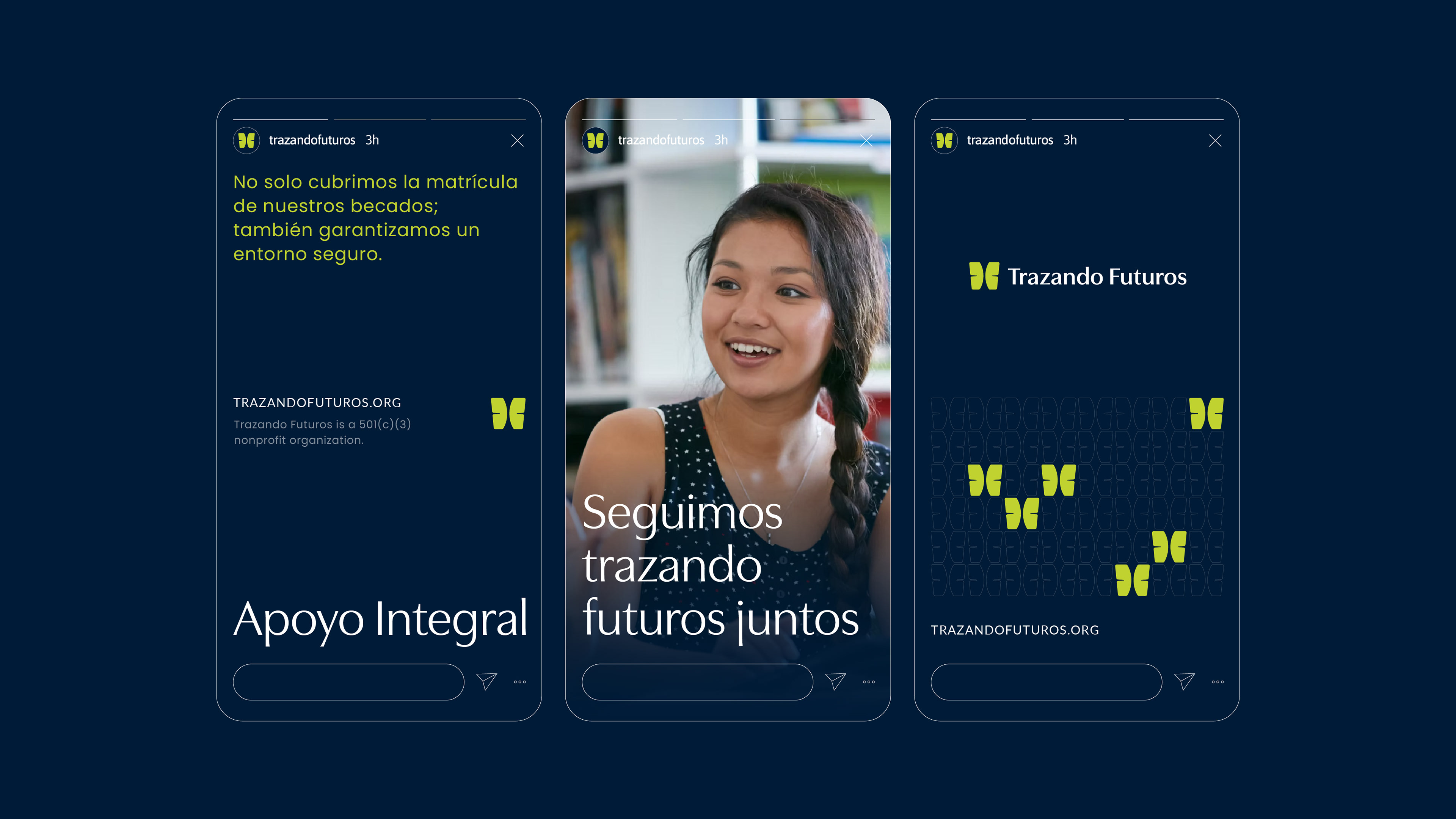
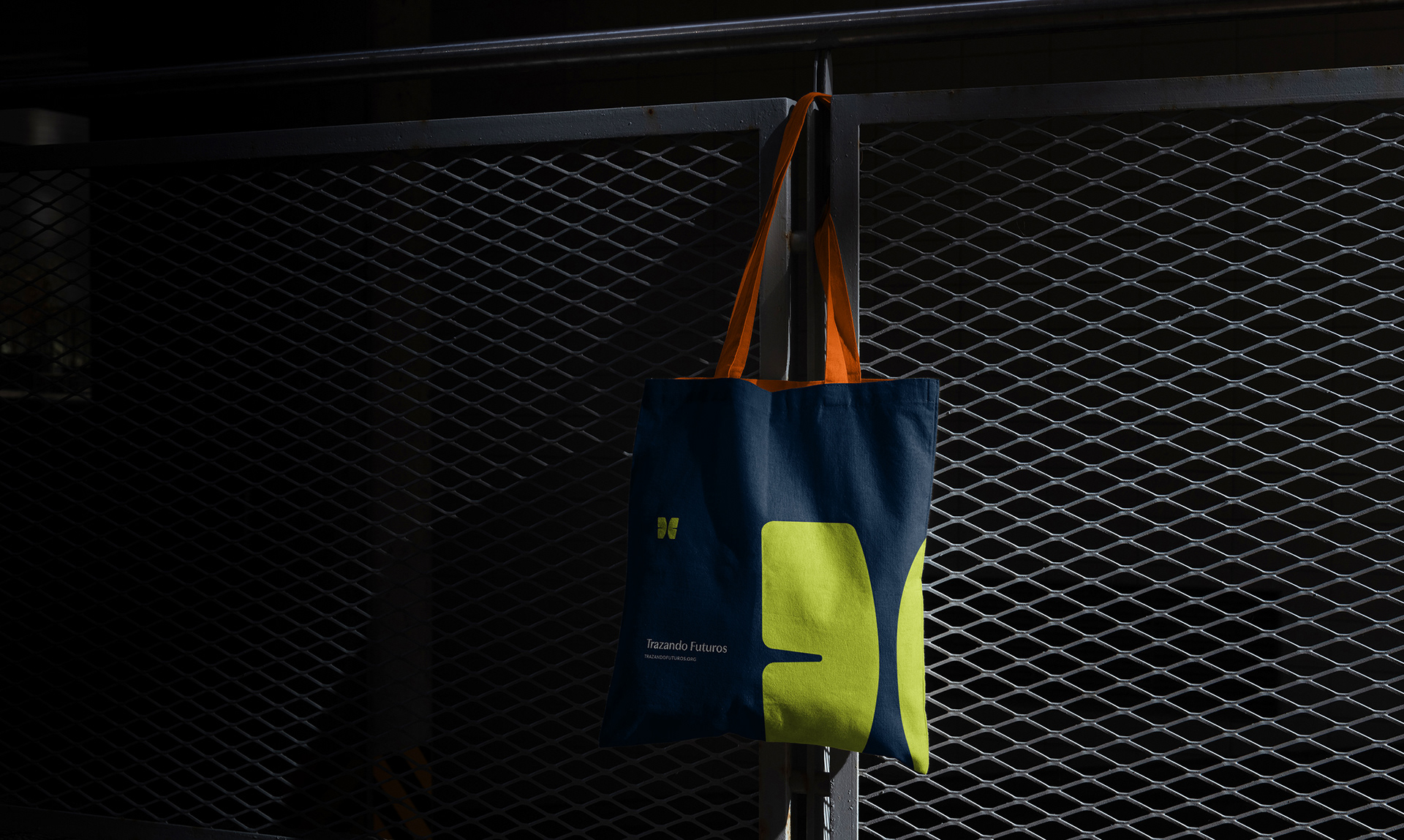
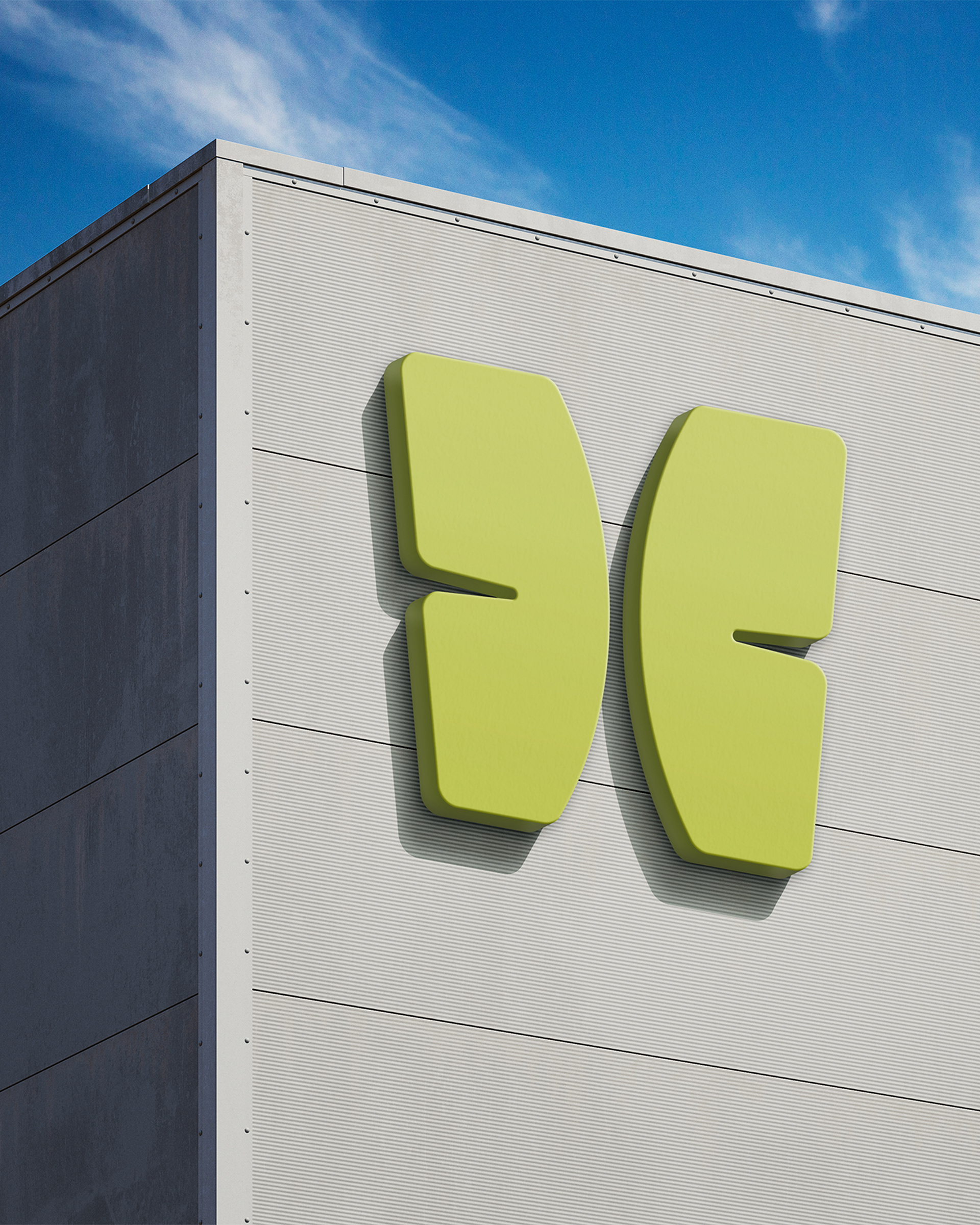
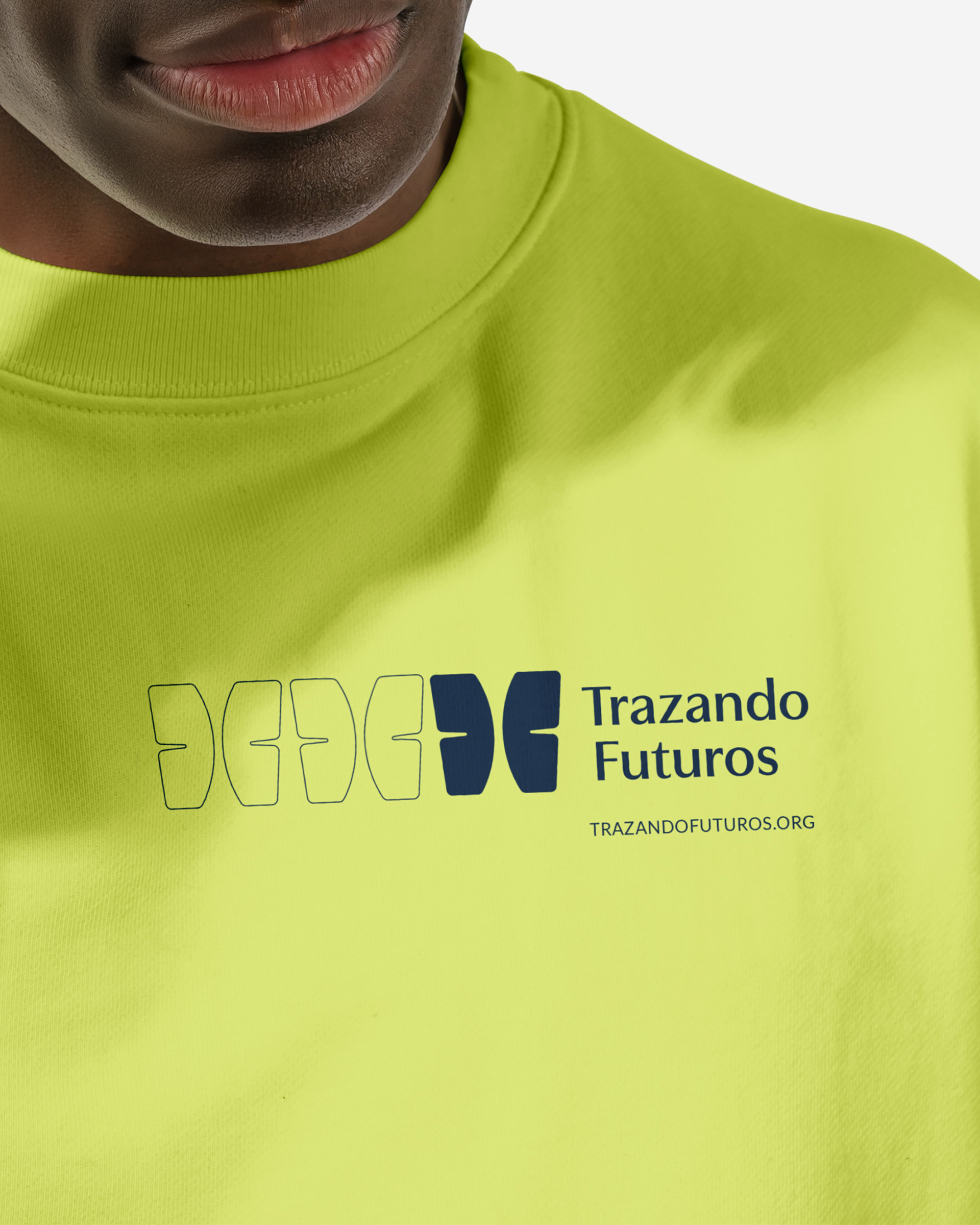
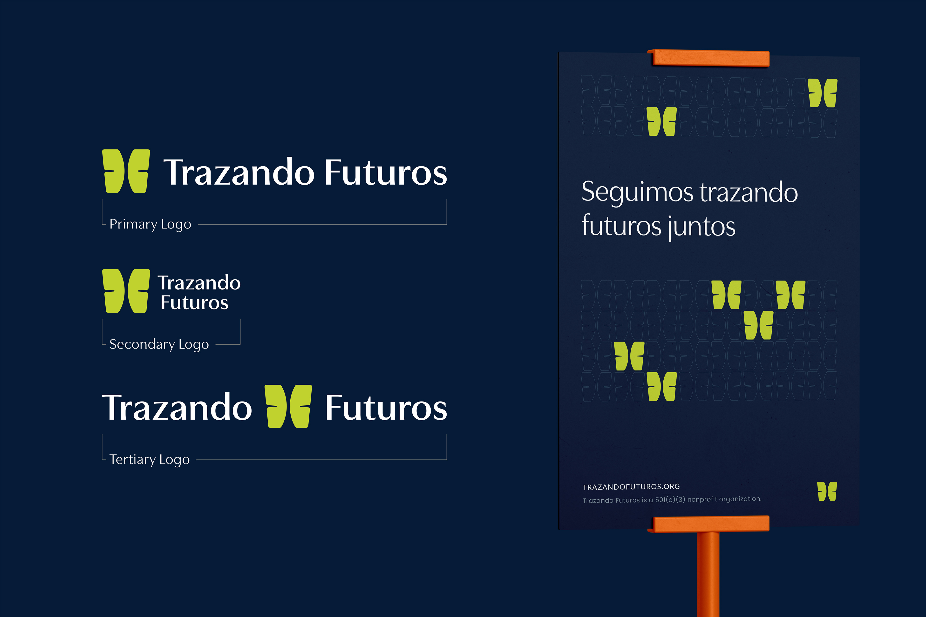
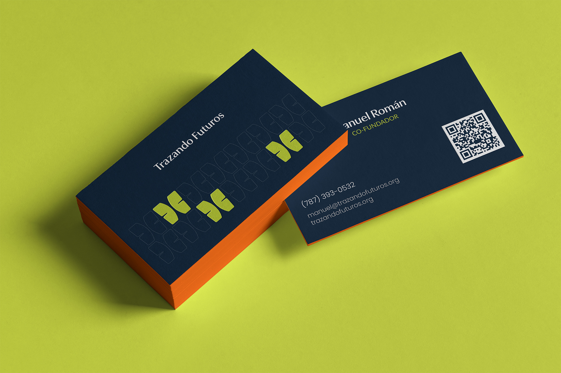
The visual identity is built around the idea of growth and transformation. The butterfly became a natural anchor for the system, representing development and new opportunities. Instead of a traditional or illustrative approach, the mark was designed with a structured, geometric construction. This brings stability and formality, aligning with the seriousness of the organization while preserving its symbolic meaning.
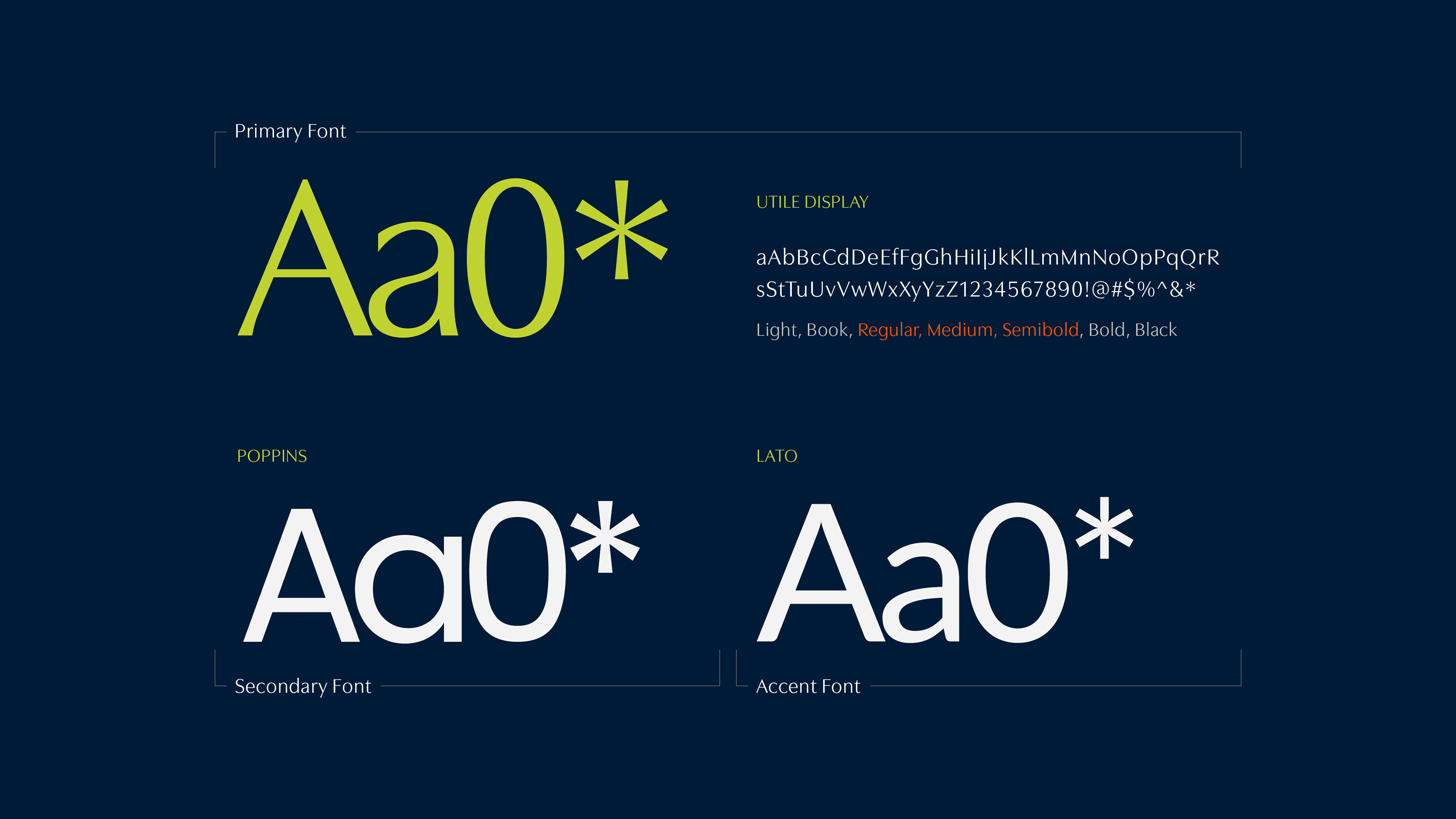
Typography plays a key role in shaping the brand’s voice. Utile Display leads the system with confidence and elegance, while Poppins brings clarity and accessibility. Lato is used sparingly as an accent, adding flexibility without disrupting consistency. Together, the type system balances professionalism with warmth.
Process, Guides, and Longevity
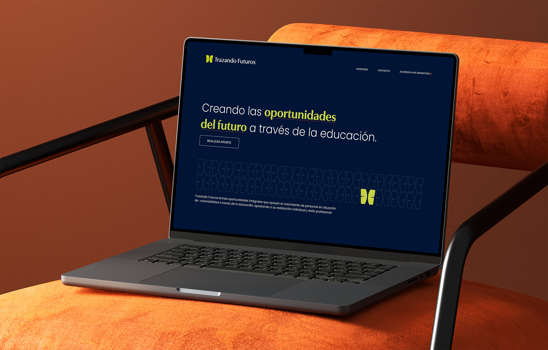
I build brands with structure in mind. Clear guidelines, defined hierarchies, and intentional systems that make application easier, not harder. This identity was designed to translate seamlessly between digital platforms and printed collateral, ensuring consistency without rigidity.
Designing With Purpose
This project reinforced why I want to continue working with nonprofit and mission-driven organizations. Strong branding helps the right message reach the right people with confidence and clarity.
Trazando Futuros now has a visual identity that supports its mission, builds trust with donors, and feels ready for the future it’s helping students create. Being part of that evolution is exactly why I do this work.