Paul comes from a family that treats coffee like a sacred ritual. Growing up in Ecuador, the afternoon coffee break is more than just caffeine—it’s a cultural reset button. You sip, you talk, you connect. That love for coffee led him to start roasting his own beans, which he began bringing to work. When coworkers started asking for refills, Java District was born.
Setting the Mood
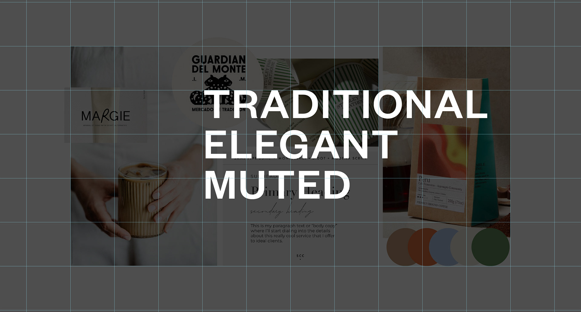
The goal was to build a brand that felt elegant yet inviting, bold but grounded, and young without trying too hard.
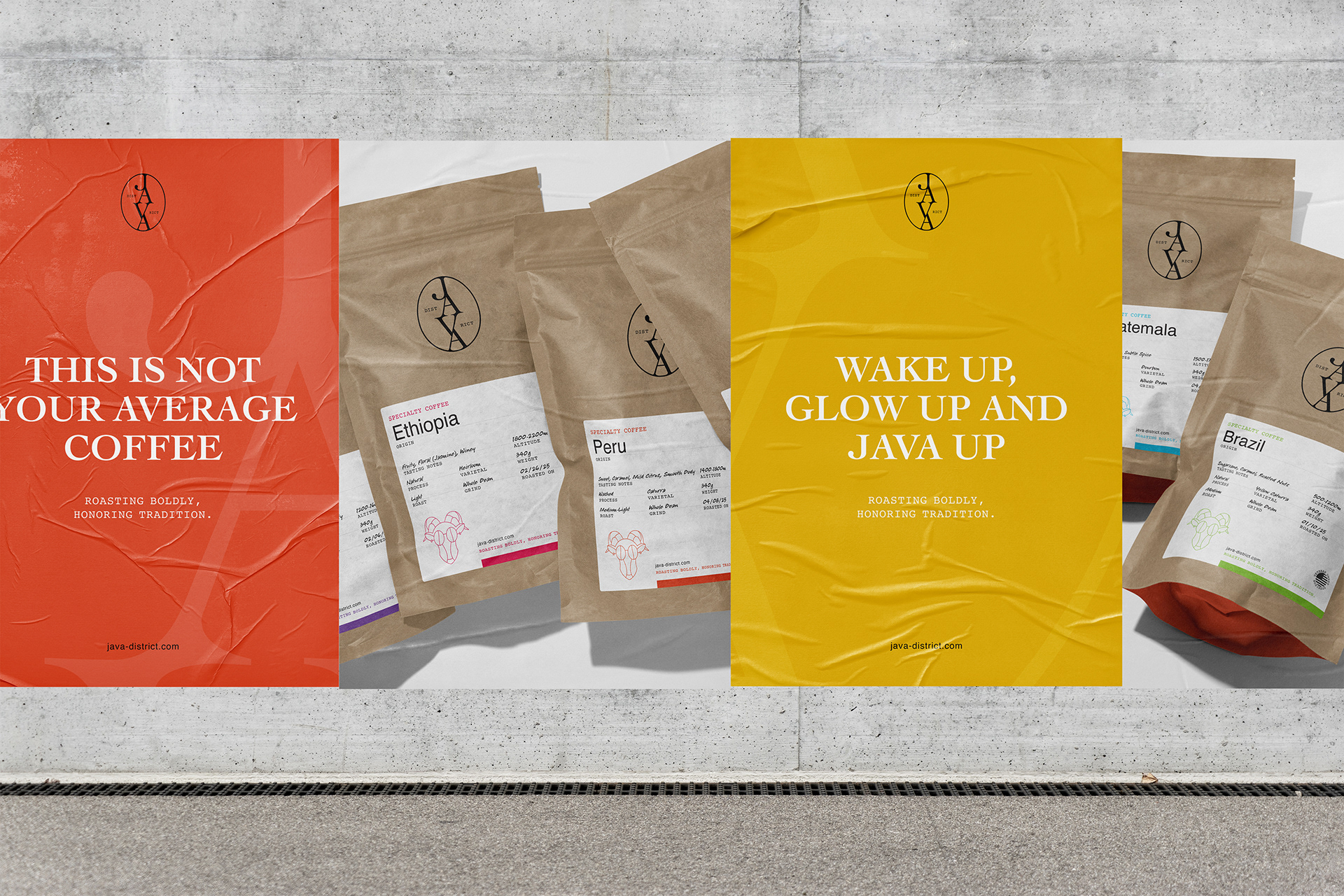
Java’s identity had to live up to its own slogan—"roasting boldly, honoring tradition"—which meant creating a visual system that respected its roots while still feeling fresh. Nothing forced. Just design that feels right.
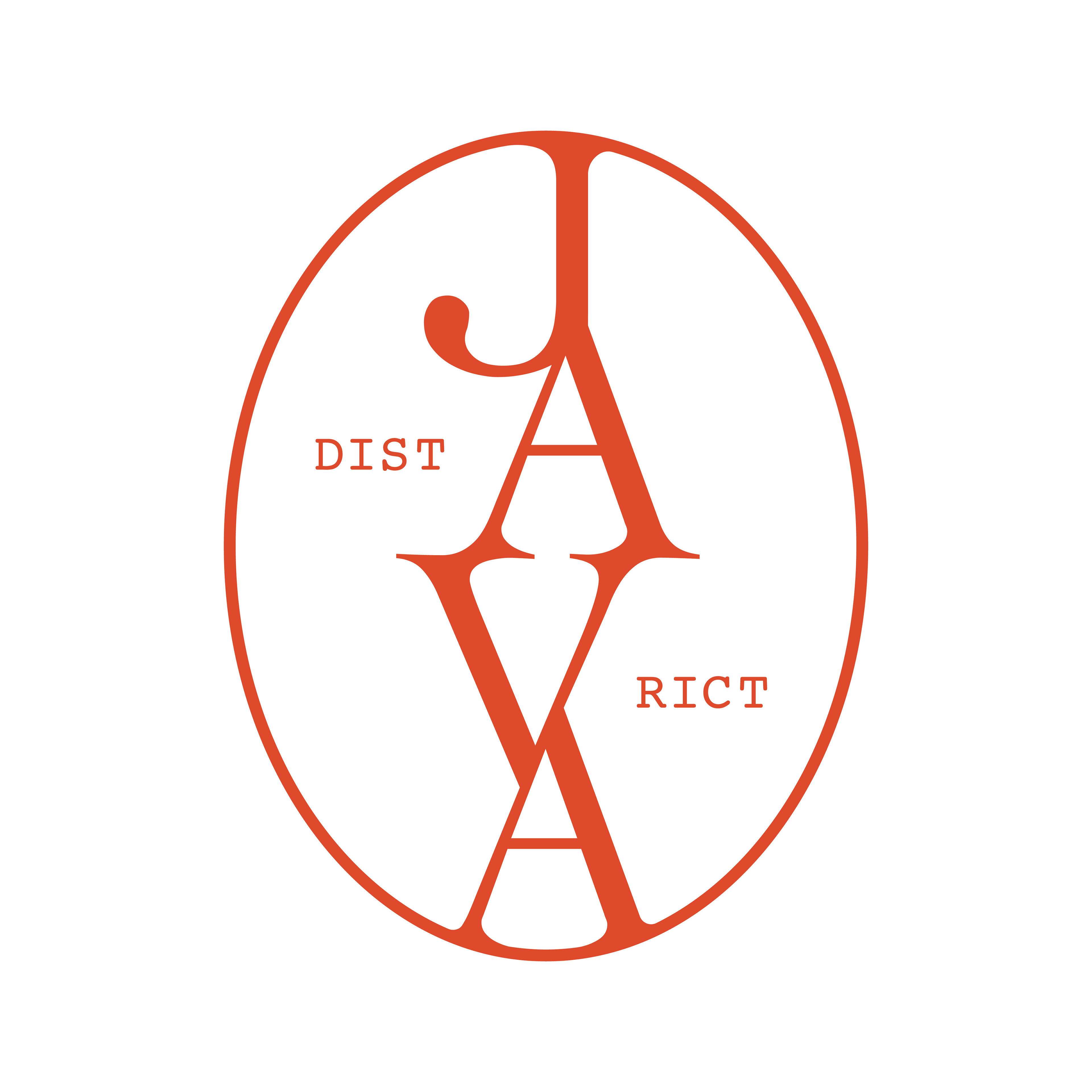
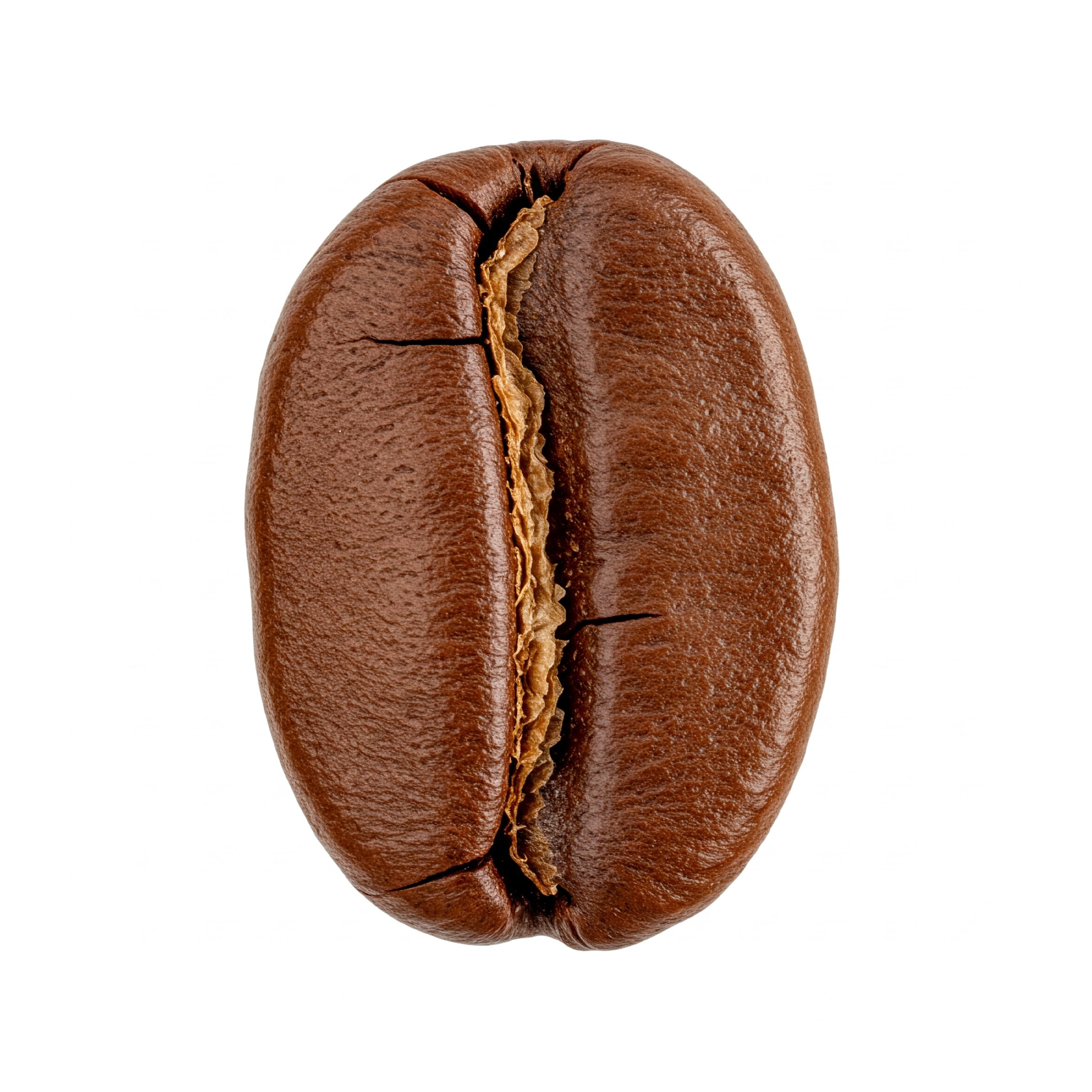
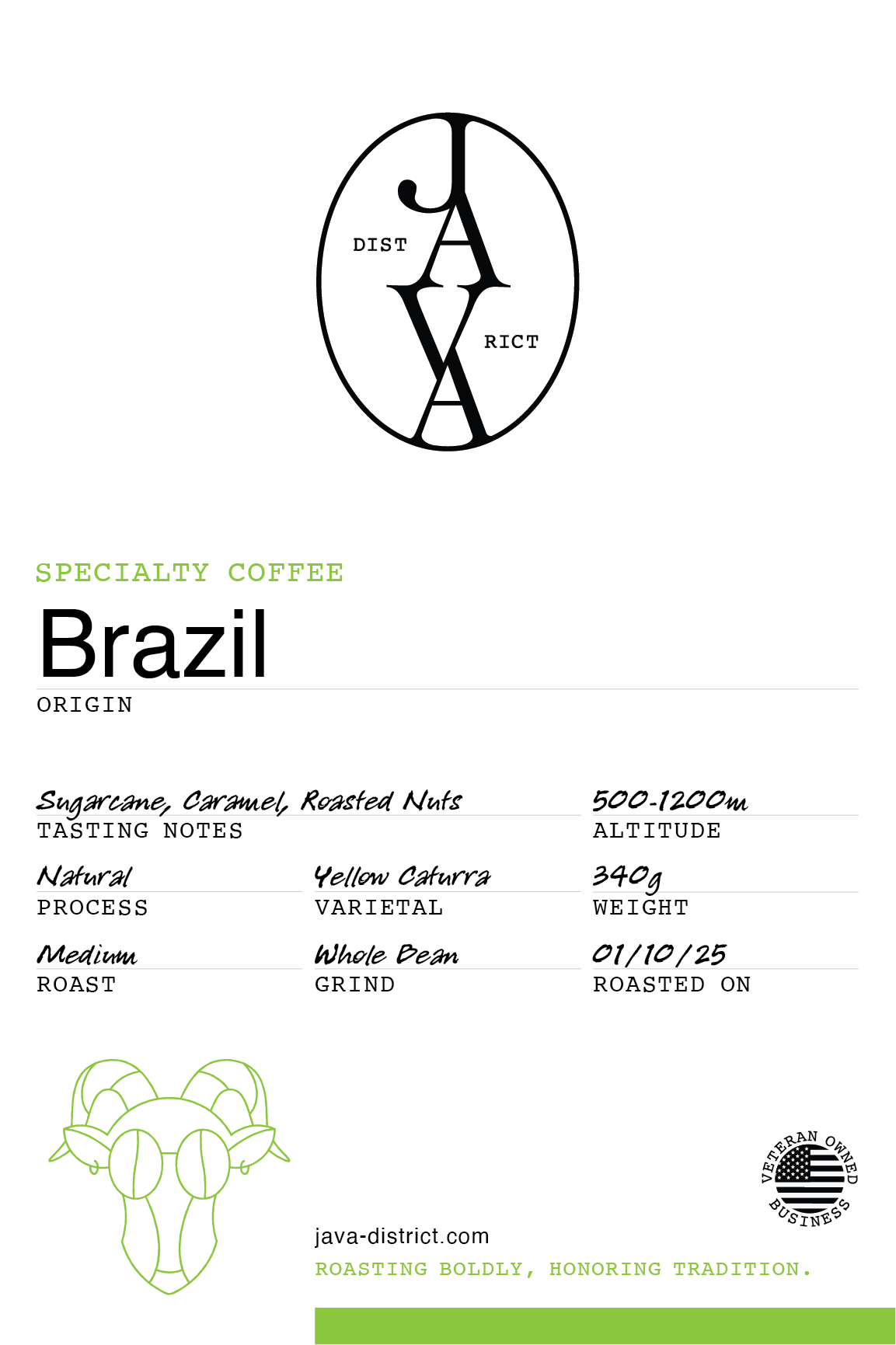
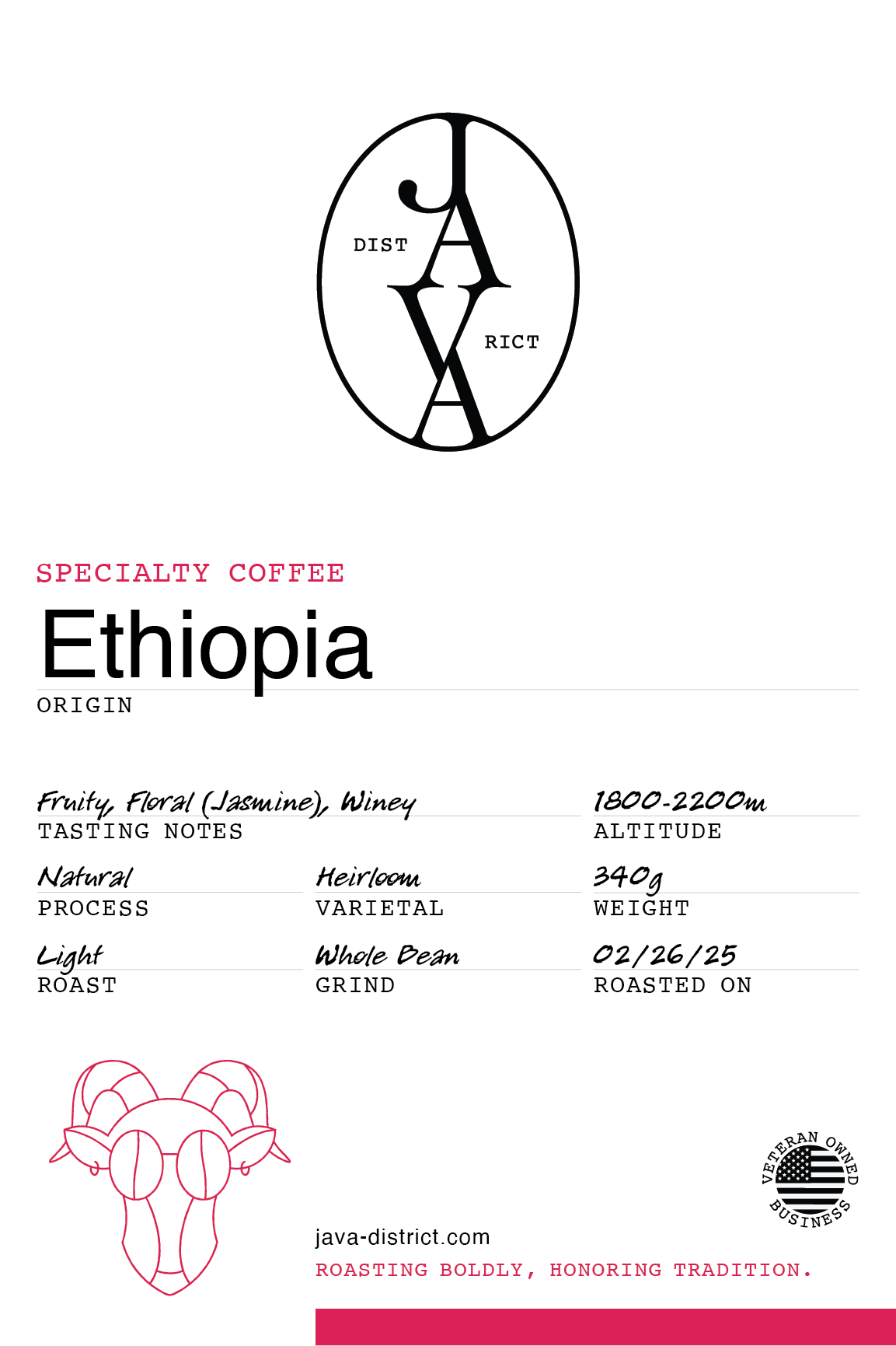
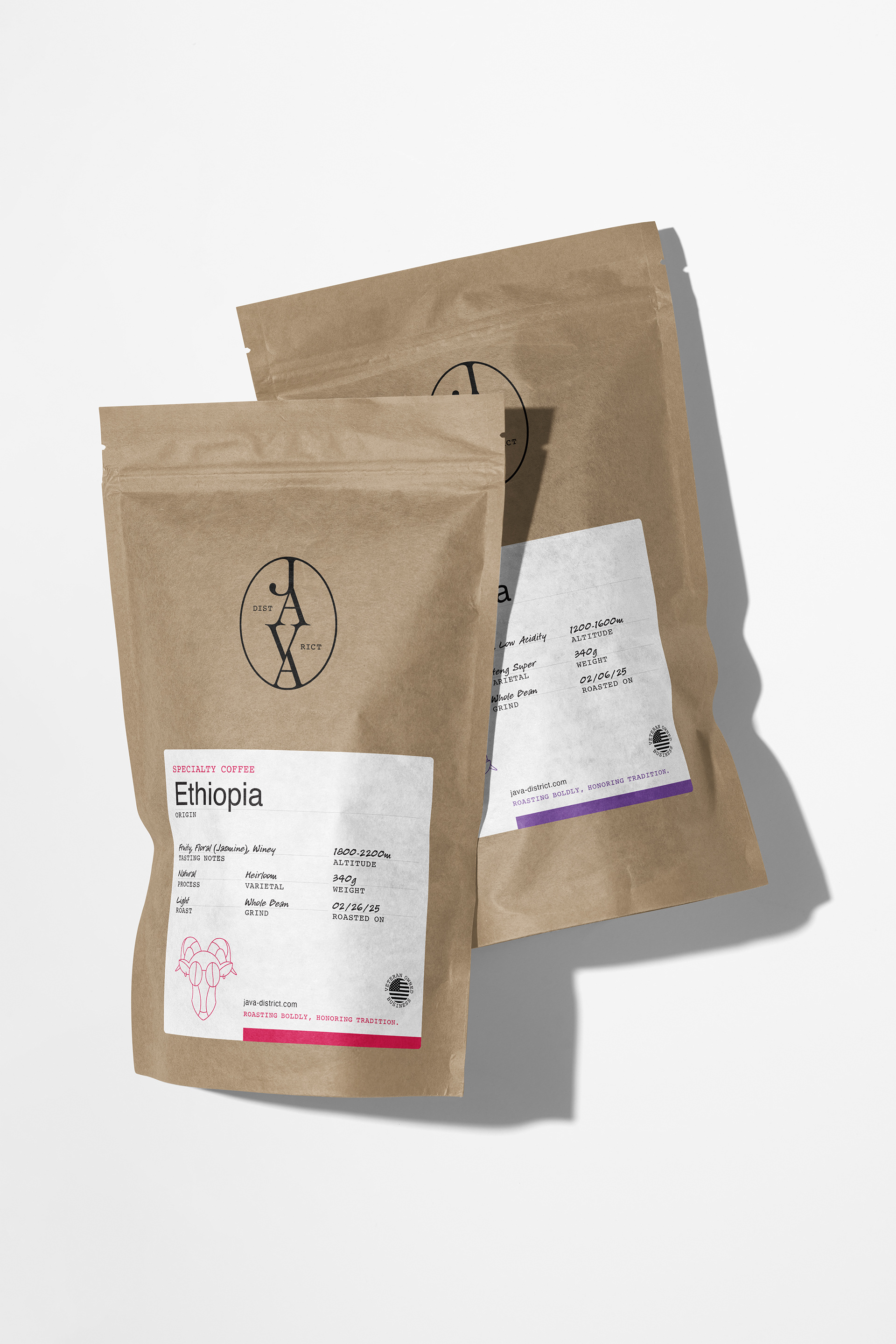
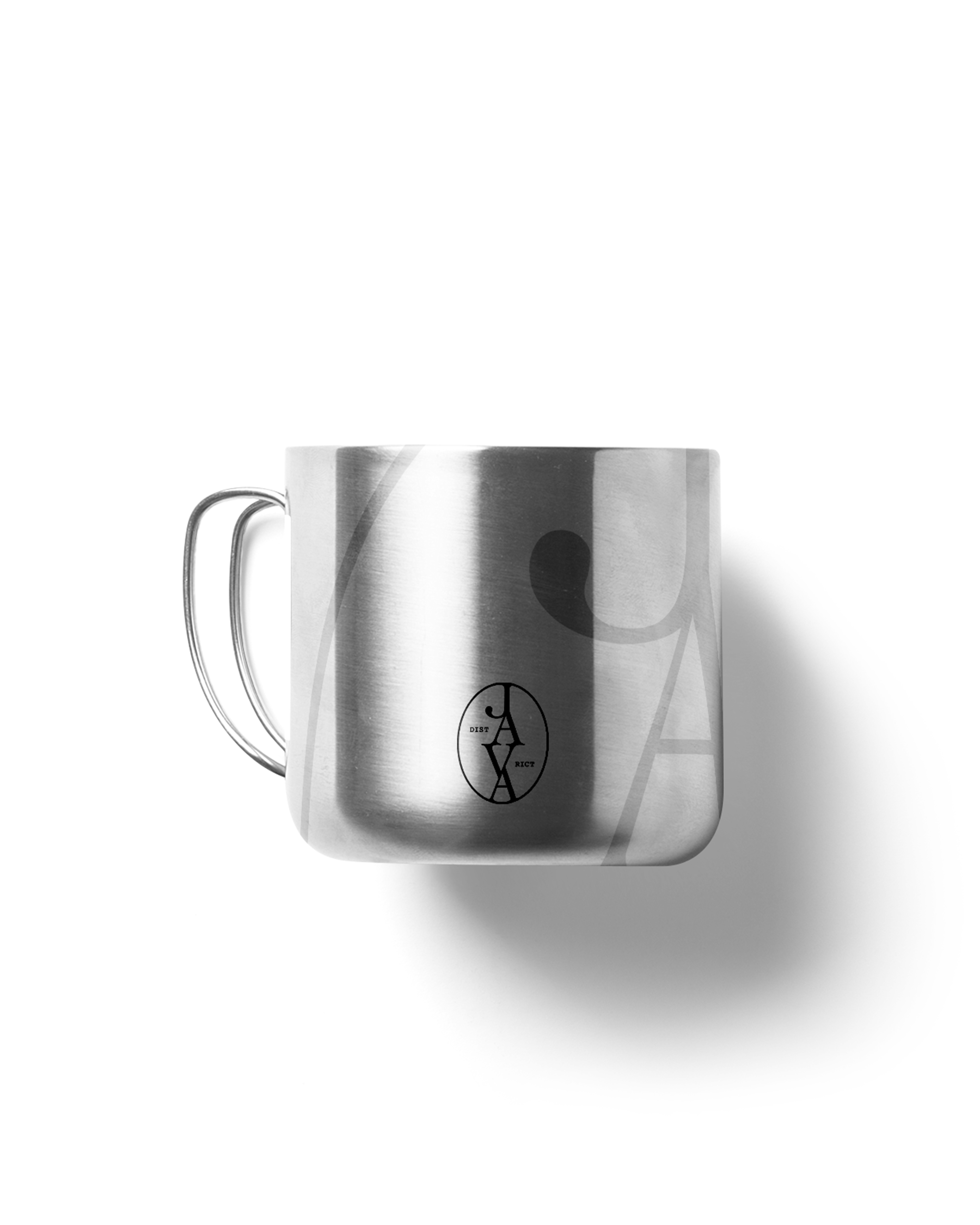
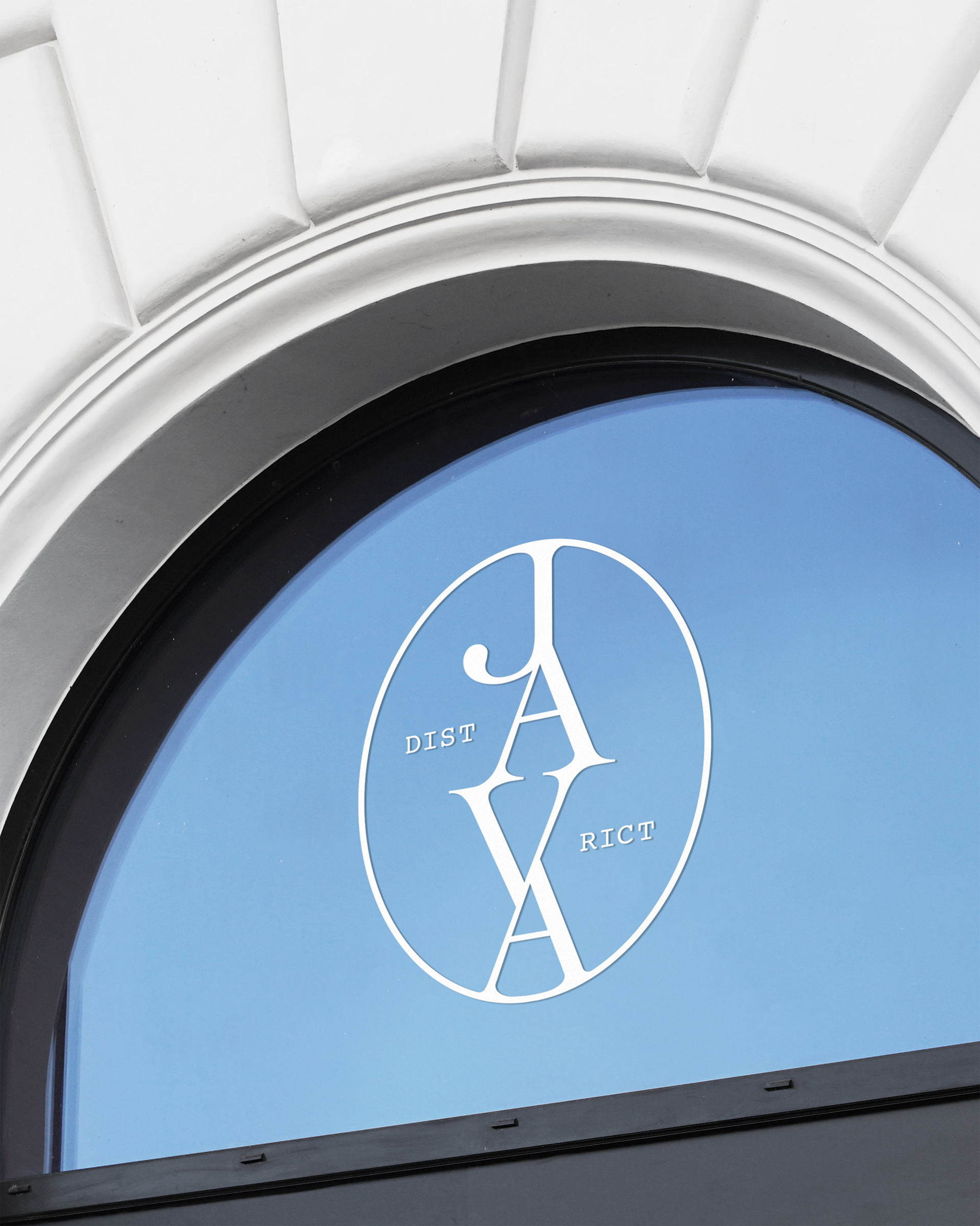
The monogram mark resembles a coffee bean. The letters “JAVA” form a subtle fissure down the middle. It’s minimal, bold, and doesn’t try to be smarter than it is. Normally, I lean toward more abstract marks, but this one hit every note the brand needed. Right balance of concept and clarity.
Enter the Goat
As a little Easter egg for packaging, I illustrated a modern goat. Why? According to coffee legend, a goat herder named Kaldi noticed his goats going full rave mode after eating mysterious red cherries. Thus, coffee was discovered. The goat lives on—this time front and center on a bag of coffee beans.
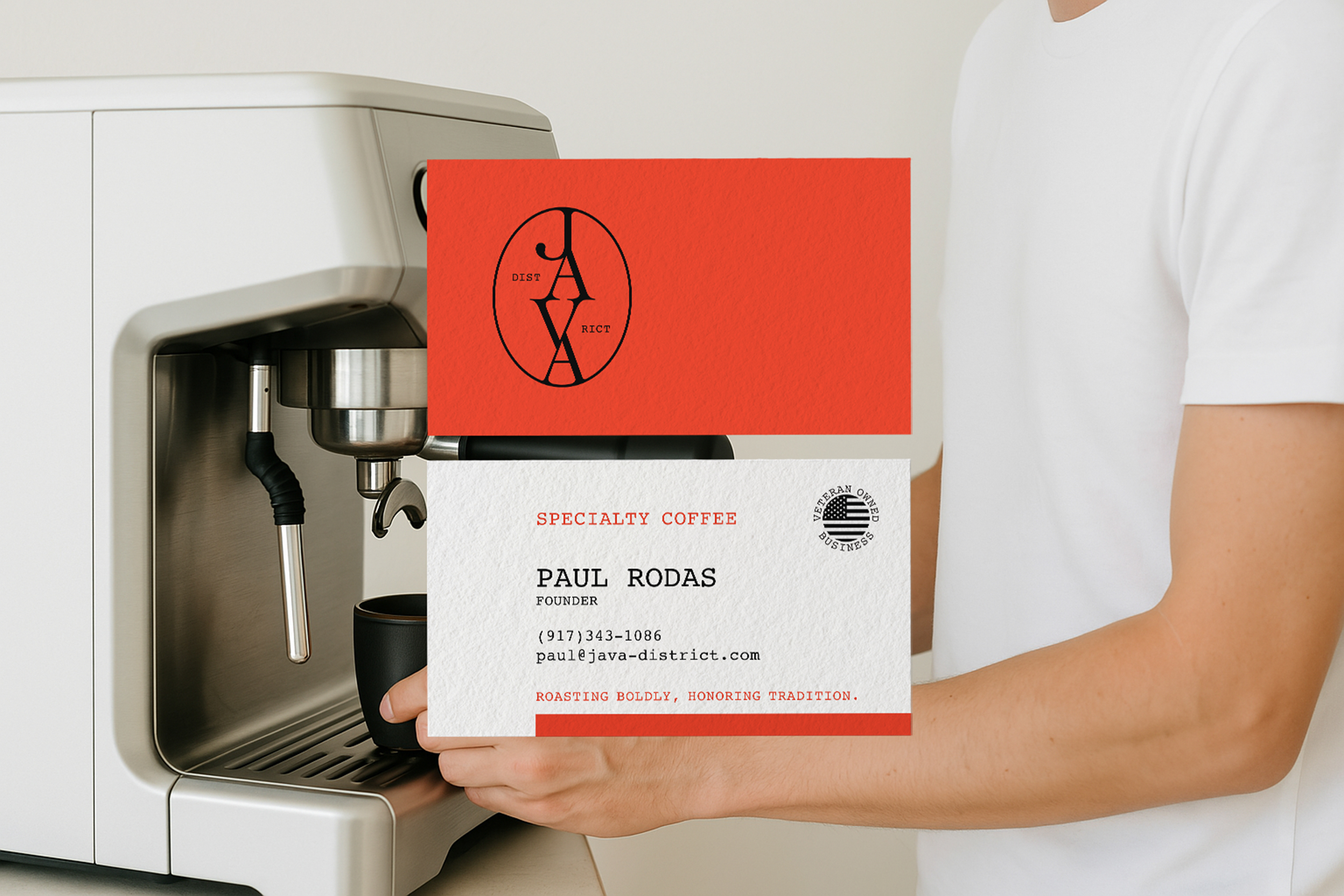
We typically stick to two typefaces, but Java District deserved three:
Cochin – for that elegant, serif energy. It’s classy but not stuffy.
Courier – a nod to Paul’s military background, and because typewriter fonts always feel intentional.
Helvetica – because Helvetica is Helvetica. It cleans up after the other two and makes the system feel cohesive.
Together, these fonts created a typographic palette that could flex across formal, conversational, and practical applications—mirroring the brand’s values.
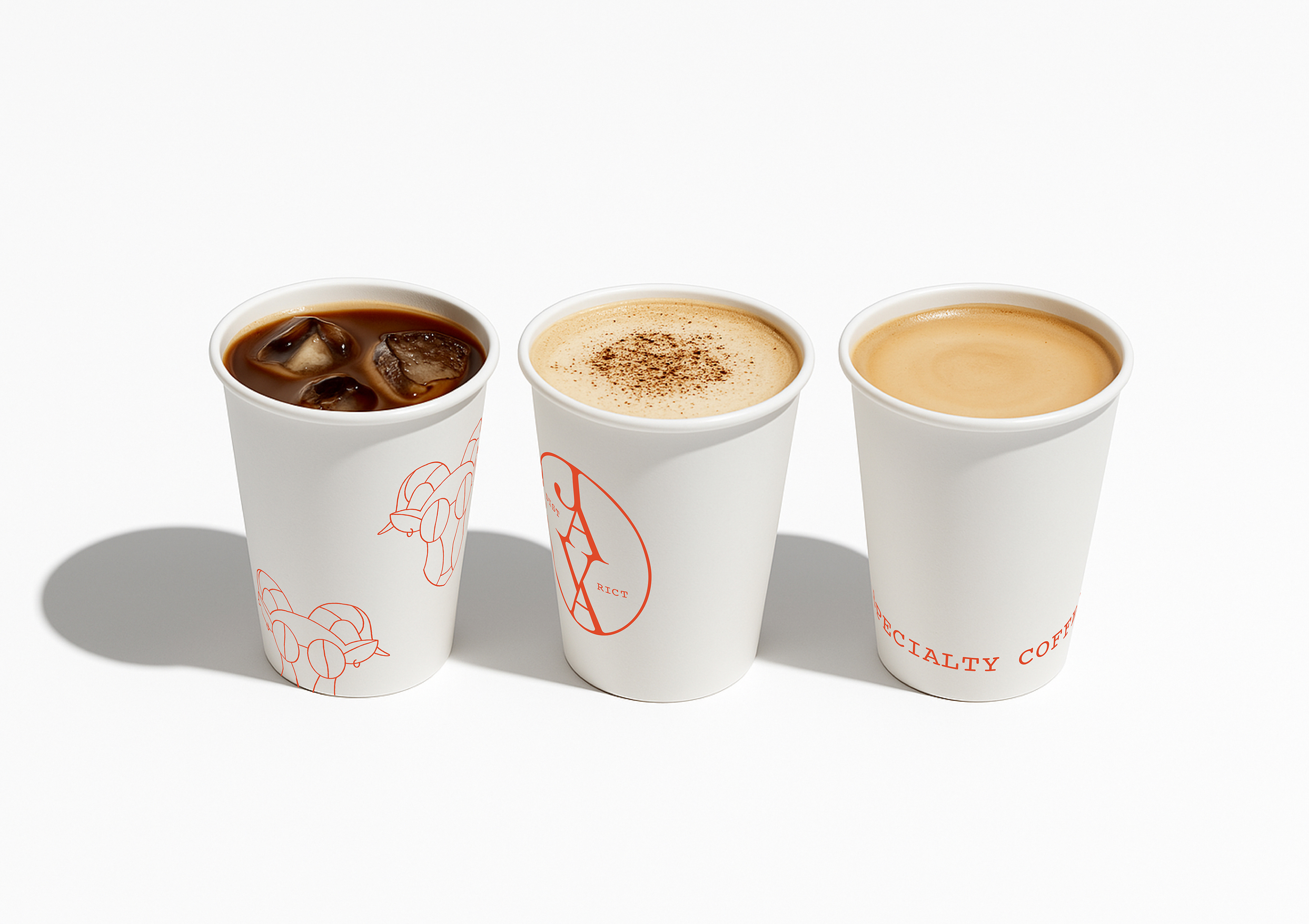
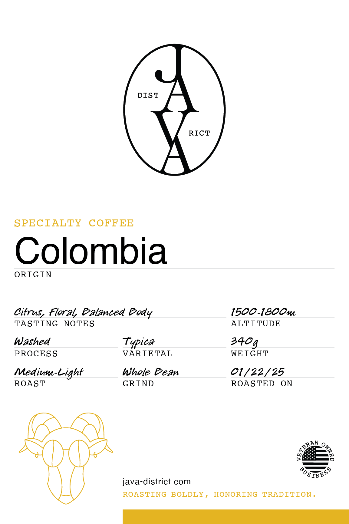
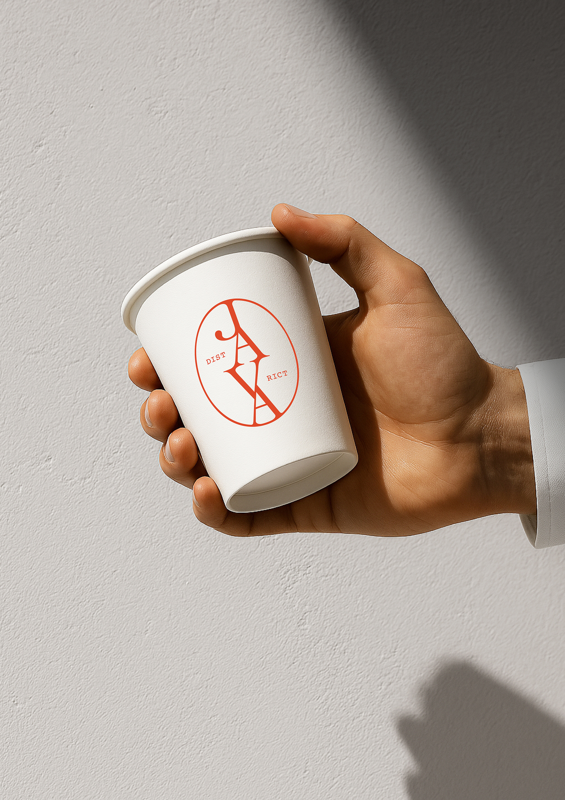
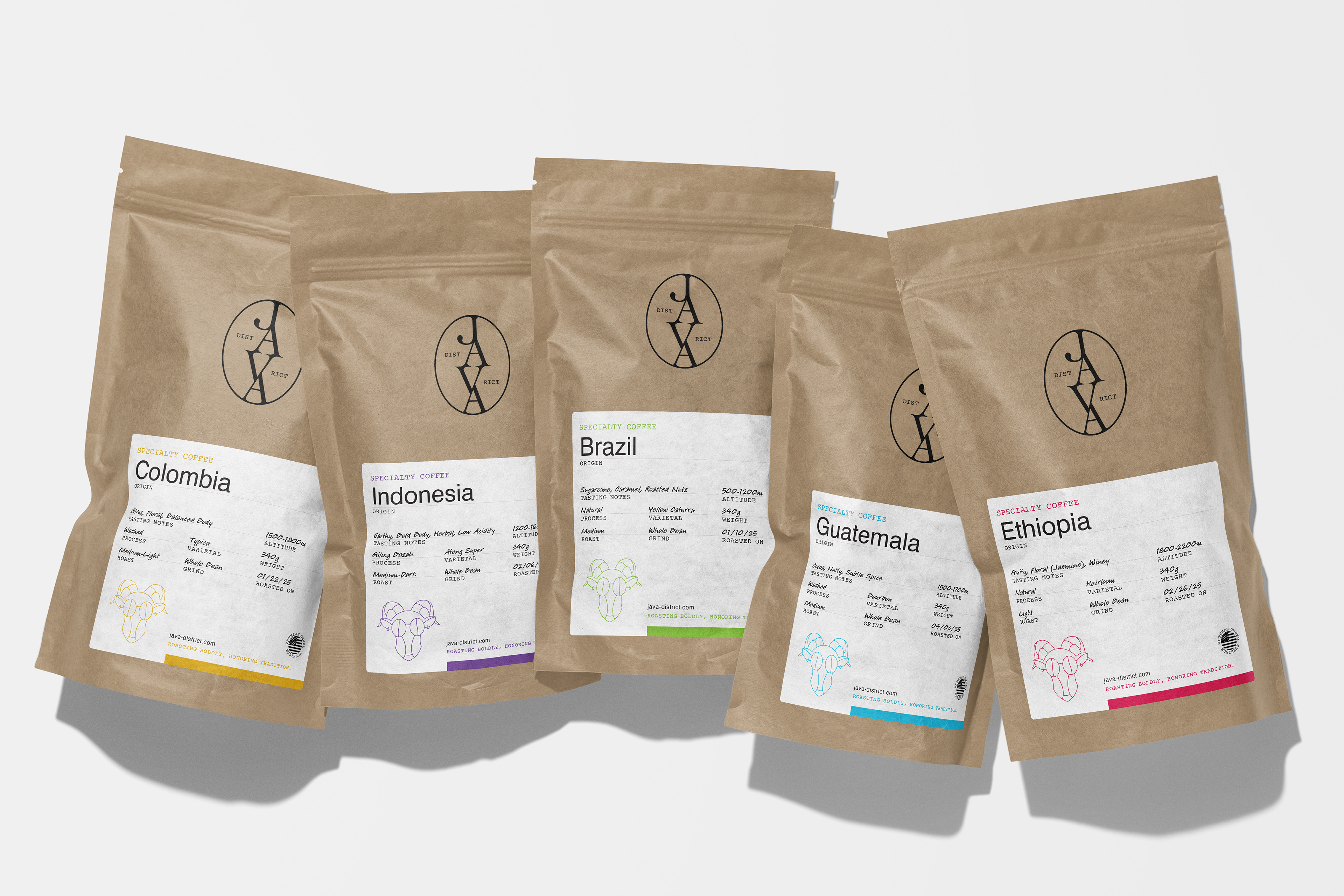
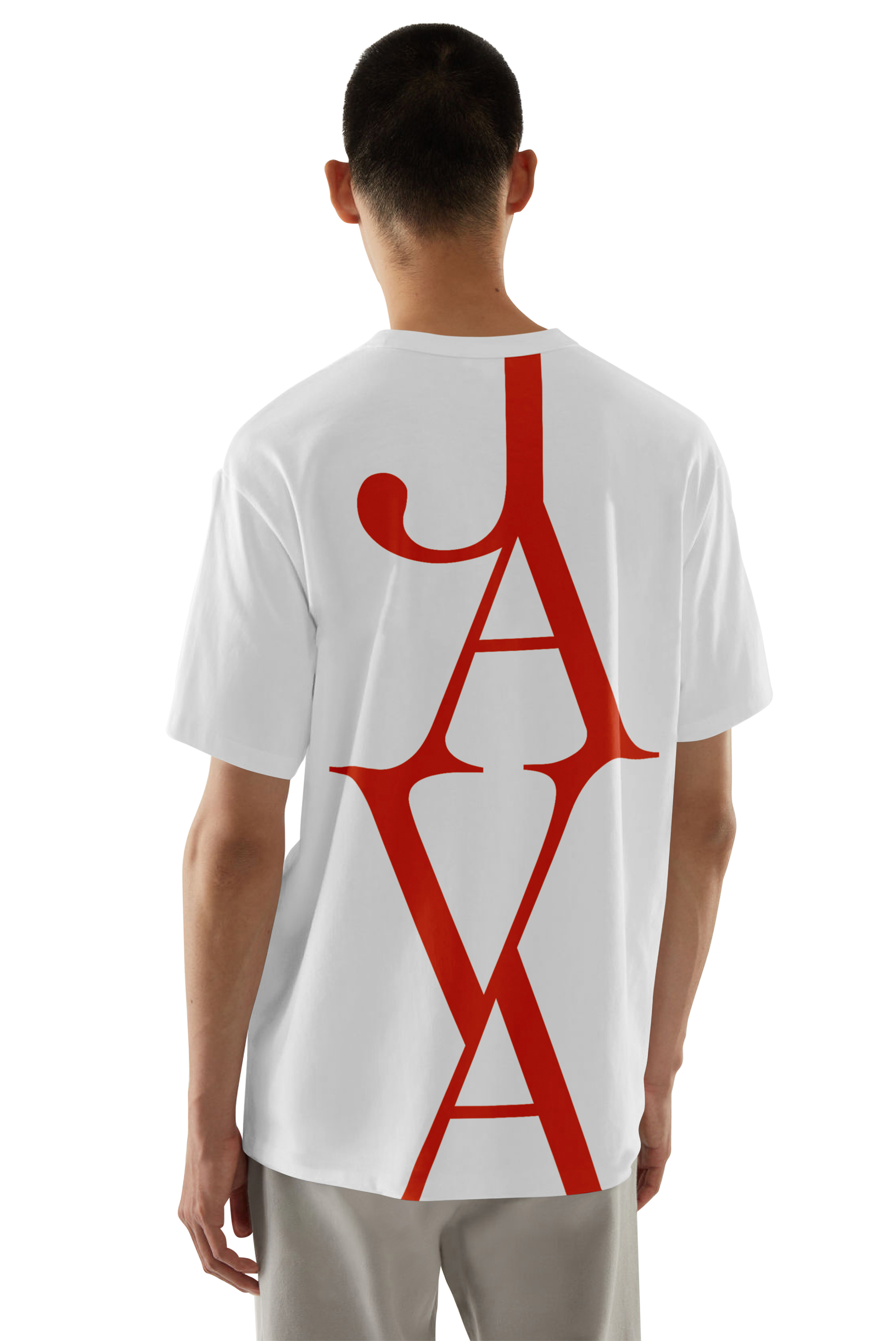
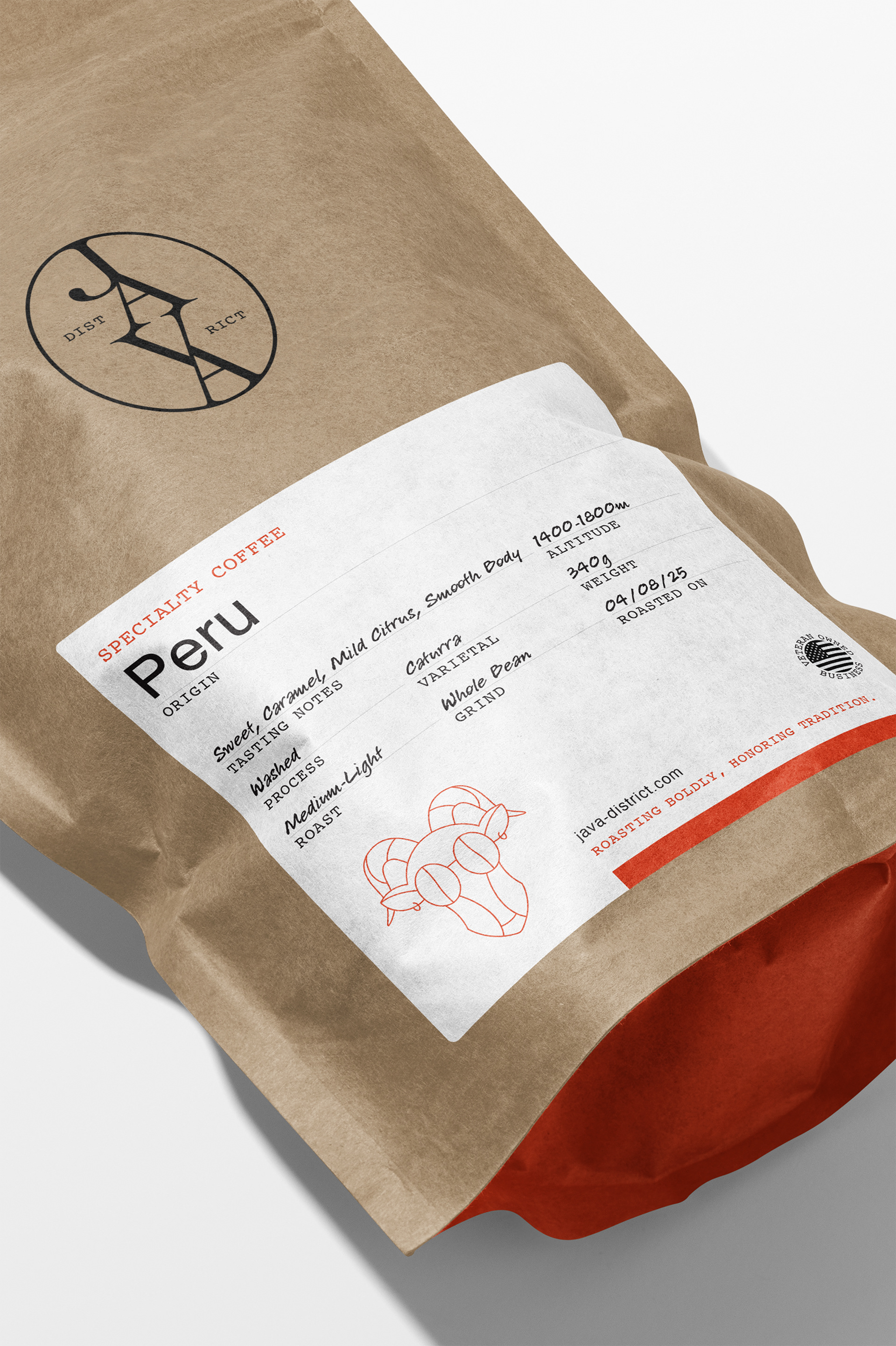
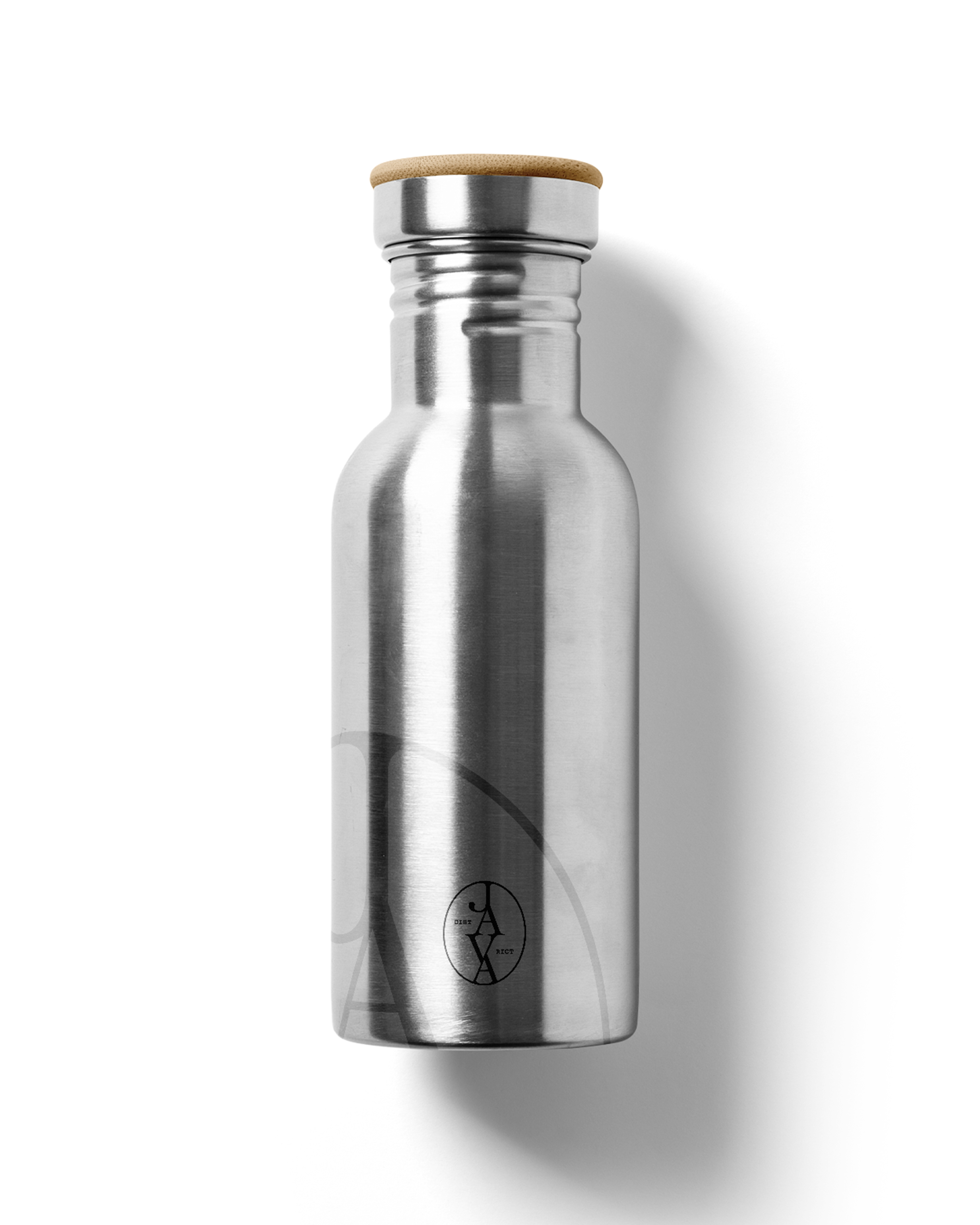
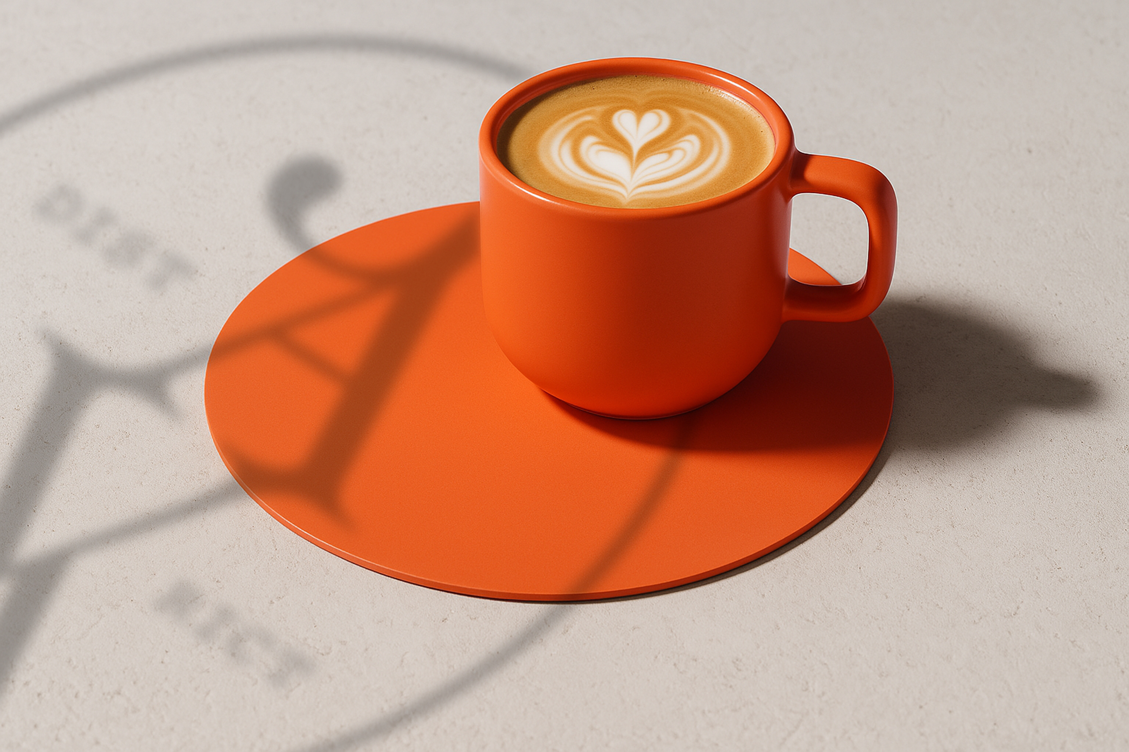
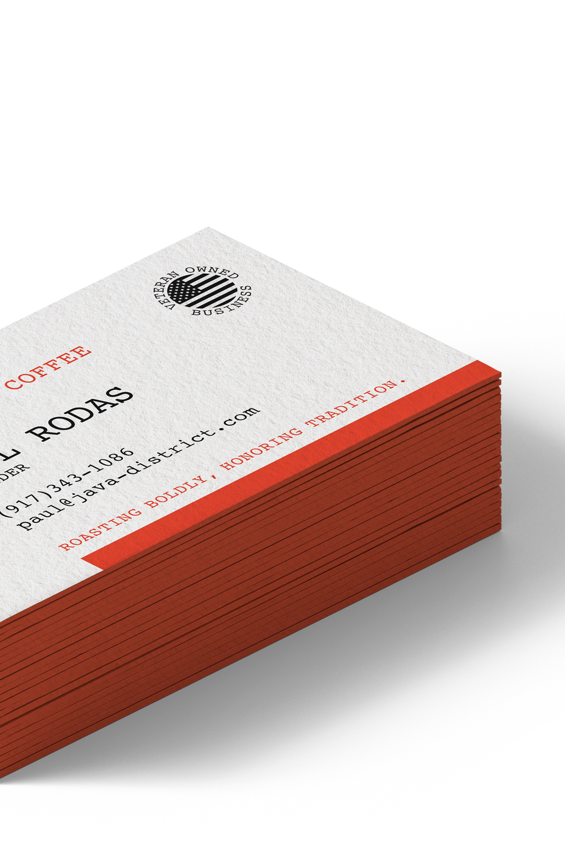
The main color is Java Punch (#df4a2b), a deep burnt orange that feels bold without yelling. It’s paired with black and white for a strong core system, but we added accent colors—blue, purple, green, and a sunny orange—for different coffee types and future products.
Final Thoughts (and Mild Anxiety)
Look, designing for coffee brands is stressful. Everyone drinks coffee. Everyone has an opinion. The market is saturated, the standards are high, and I do not even drink coffee because it gives me anxiety. But here’s the thing—sometimes you just trust the process, follow the vibe, and design what feels right.
Java District is currently live internally, and Paul was kind enough to let me share the work. I'm proud of how it turned out—but more importantly, I'm glad I got to help bring Paul’s vision to life.